
What we build together
No templates. No shortcuts. Just work we're proud of.
“Liis showed up to our first call prepared and had already researched our brand. She made it easy for me to make sense of my messy thoughts and delivered everything on time. Liis captured exactly what I imagined.”
“Working with Liis was honestly a turning point for my business. Before my brand felt scattered and unclear, now it feels like a true reflection of who I am. I finally feel confident showing up and sharing my work with the world.”
“It has been fantastic to work with Liis. She did very thorough prep work in understanding the clients’ expectations, content and audience. The execution of the brand style and all related materials was beyond expectations — very operational and systematic.”
“Liis is unique as she sees the bigger picture and has also an eye for detail. She is very easy to work with.”
Introducing — selected projects
Our work ranges from long-term clients to shorter projects. In all cases our mentality is the same — show up like we're part of the team, and leave no trace of dependency when the project is done. Our goal is to make our clients not need us — to keep using the tools we've created with seamless confidence.
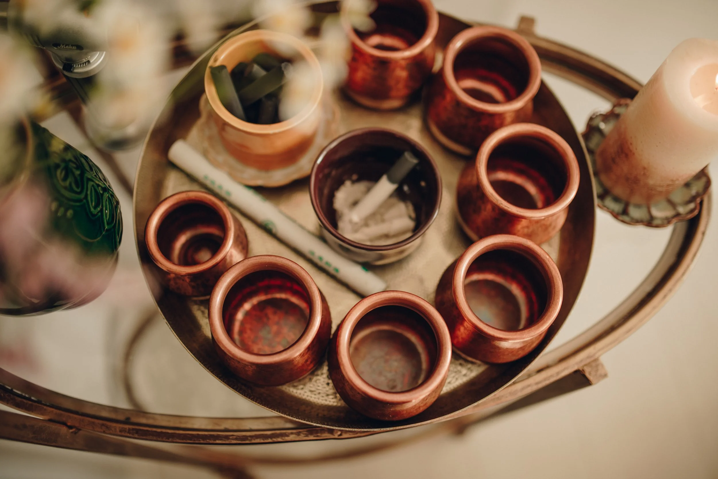
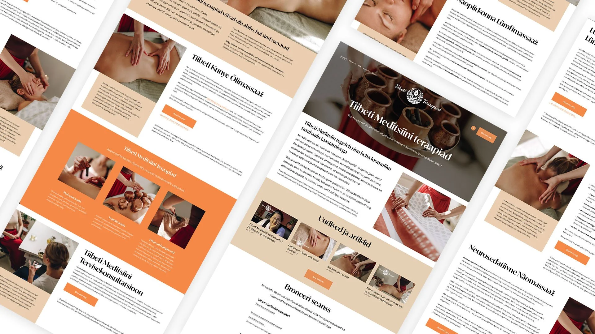
Tiibeti Teraapiad
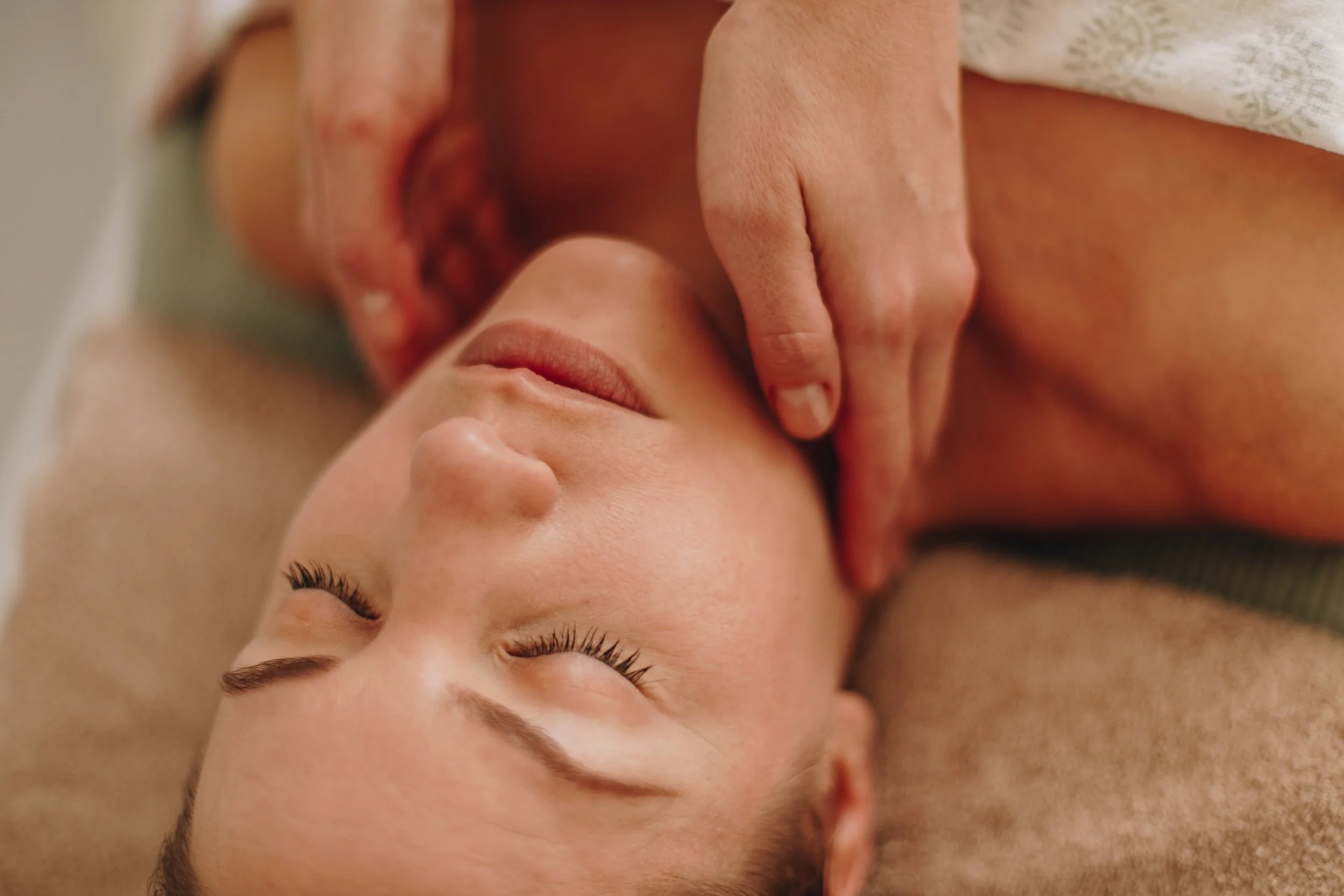
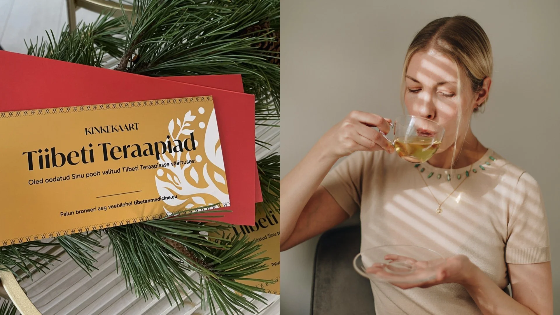
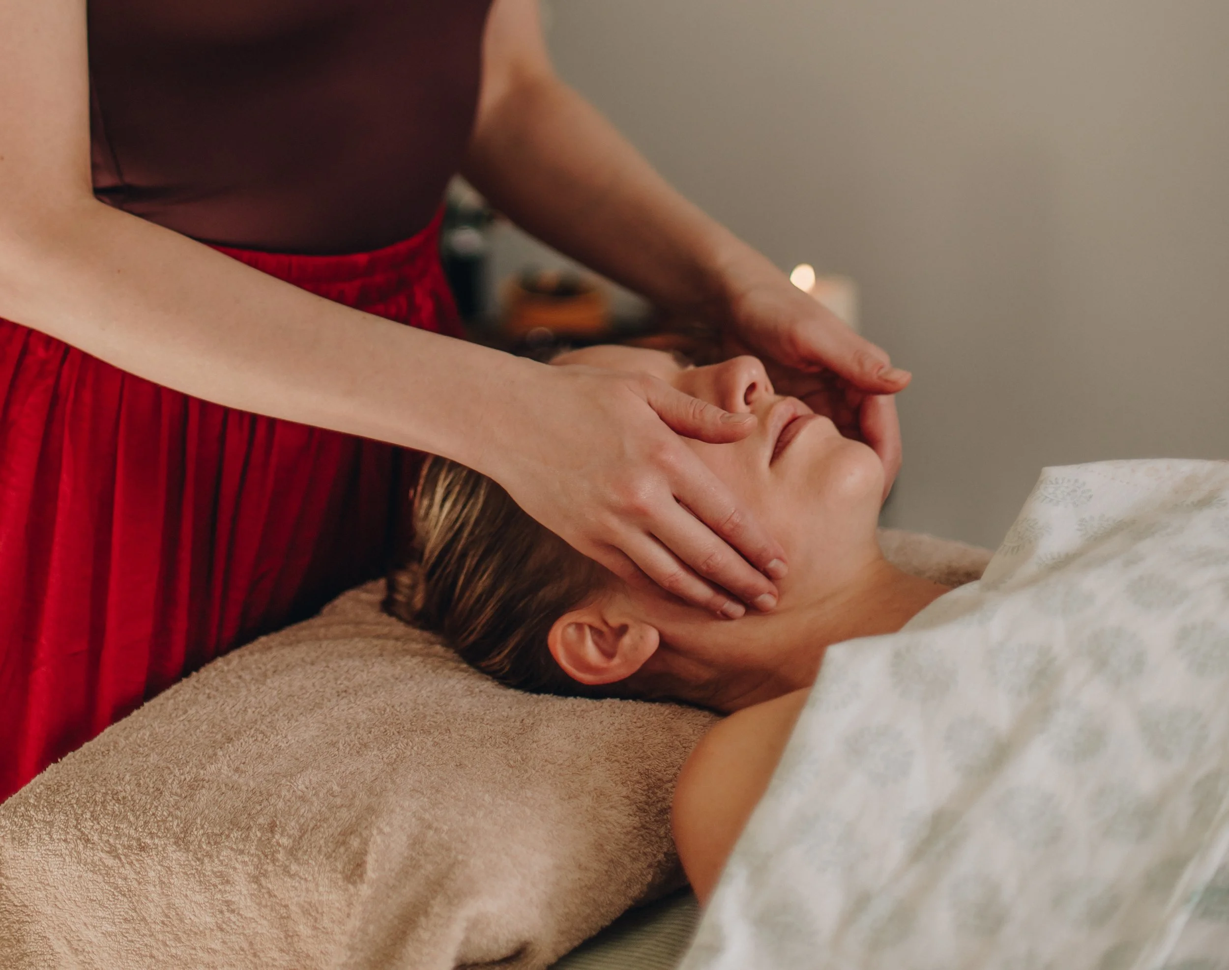
Tiibeti Teraapiad is a personal brand that Liis created for her Tibetan Medicine practice. As her own client, Liis held herself to the highest standard to achieve a result that communicates the down-to-earth nature of Tibetan Medicine while keeping a trustworthy and professional image.
Liis created the branding and website to communicate the services offered extensively through words and visuals. She also hired a professional photographer and directed the photoshoot to achieve desired visuals. The brand has been performing exceptionally well — she’s spent zero euros on marketing and has over 200 repeating customers in one year of business.
Tiibeti Teraapiad is an excellent example of how great branding and targeted website can make the customer acquisition process effortless.
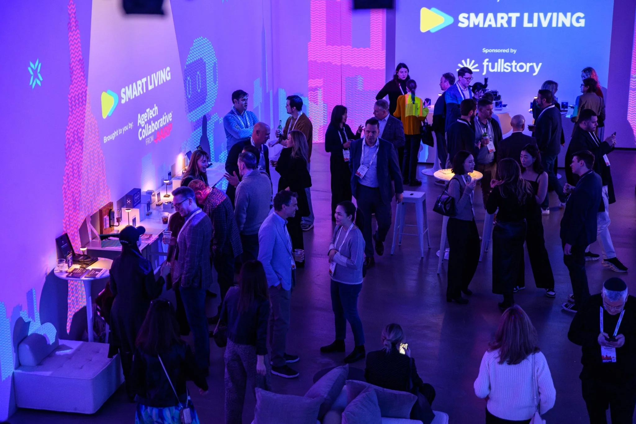
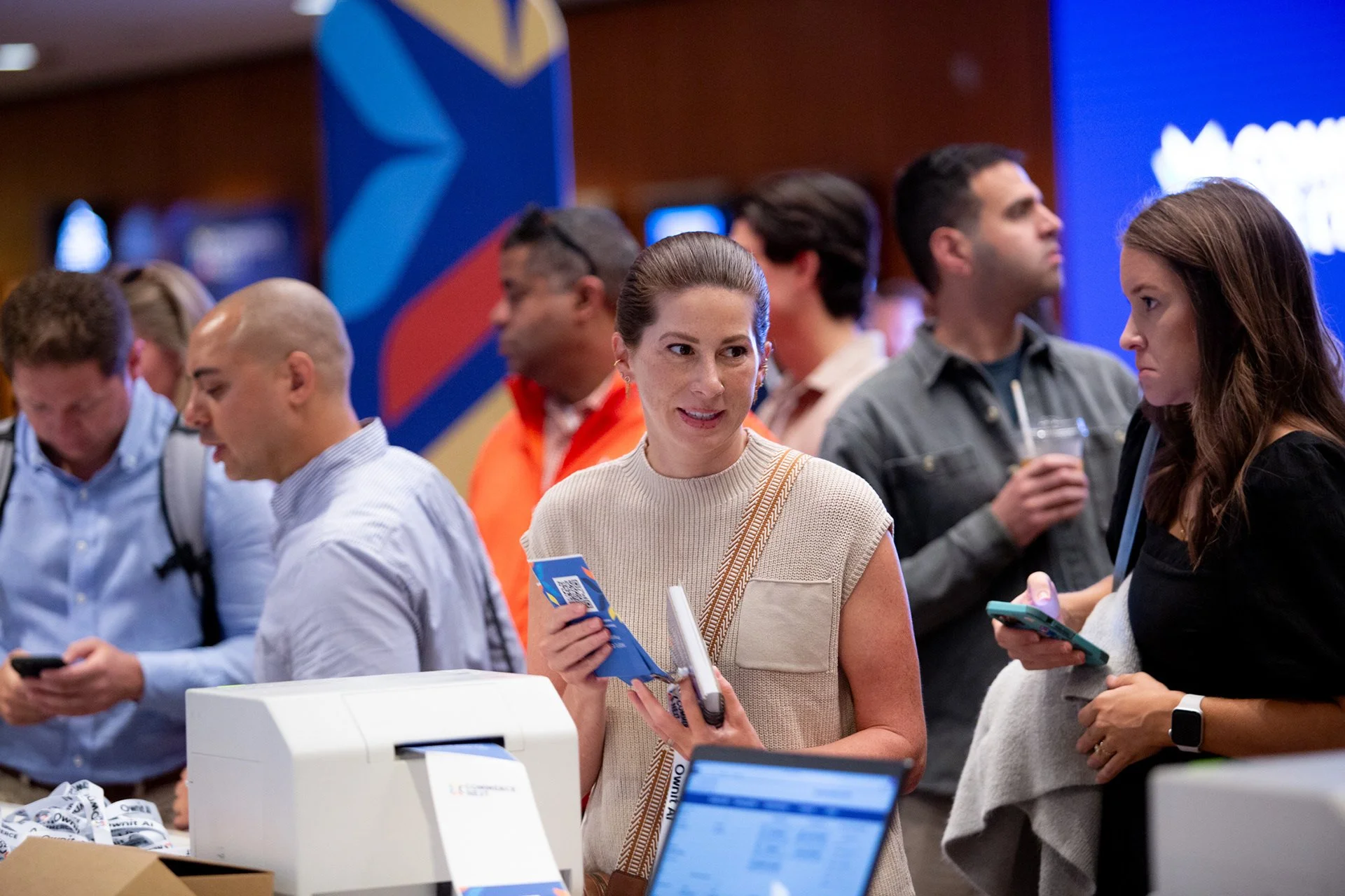
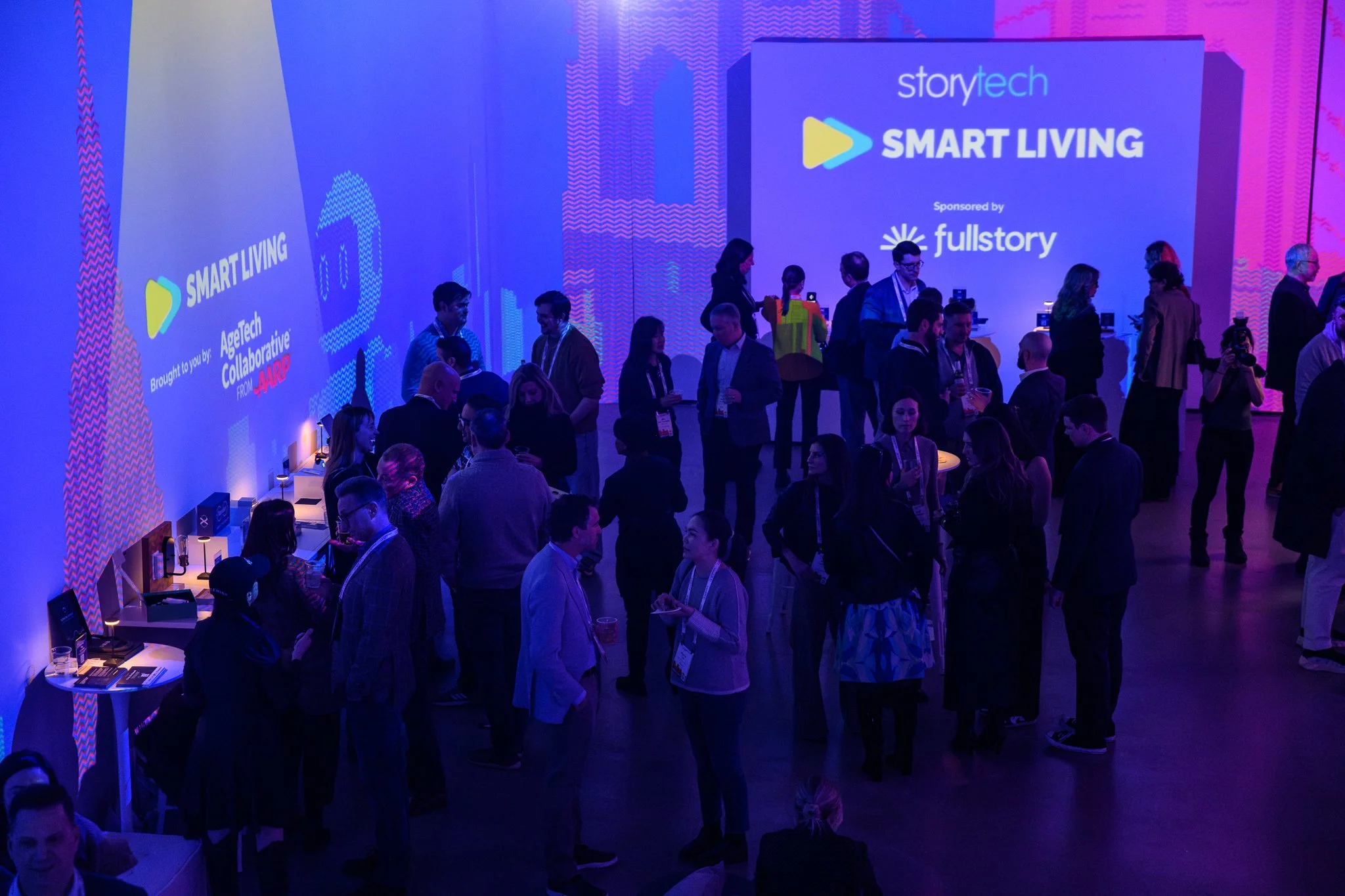
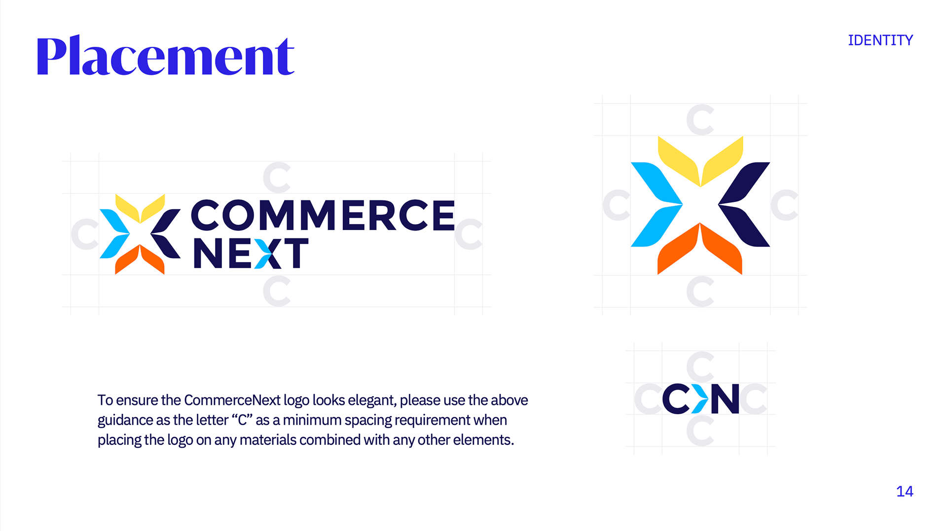
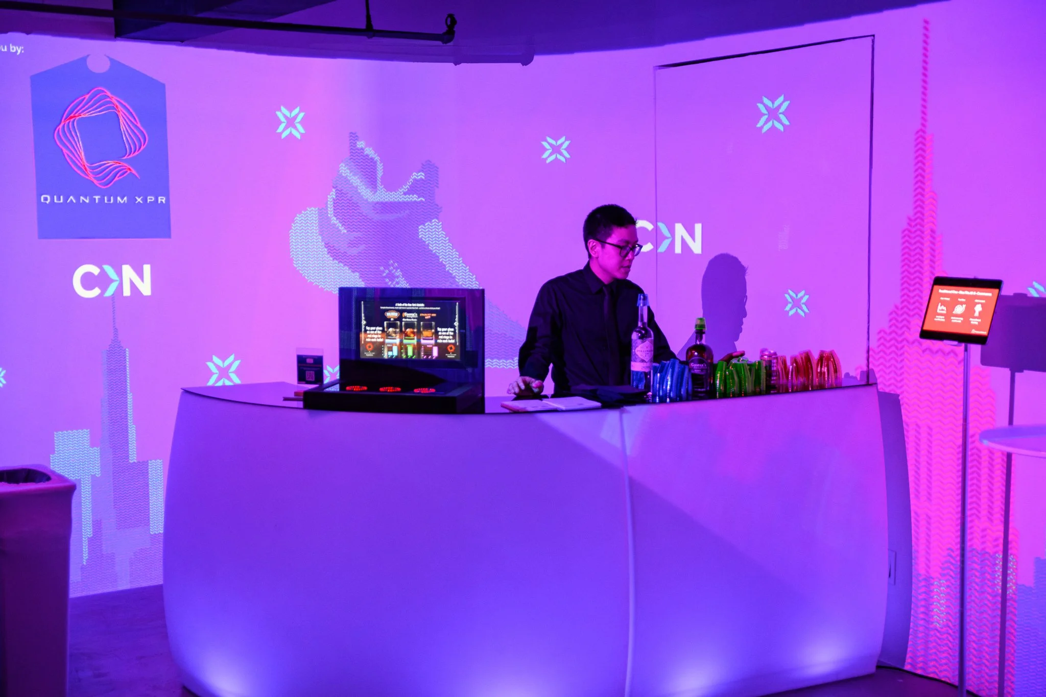
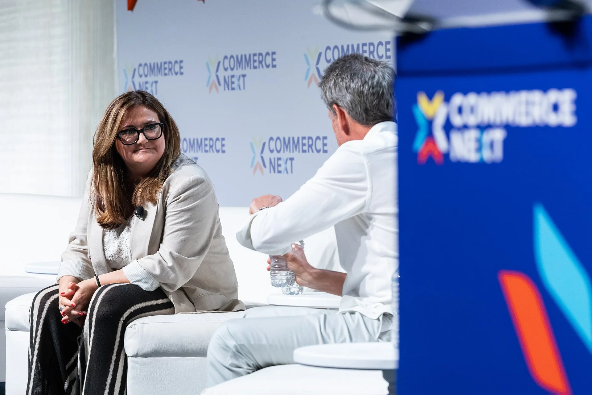
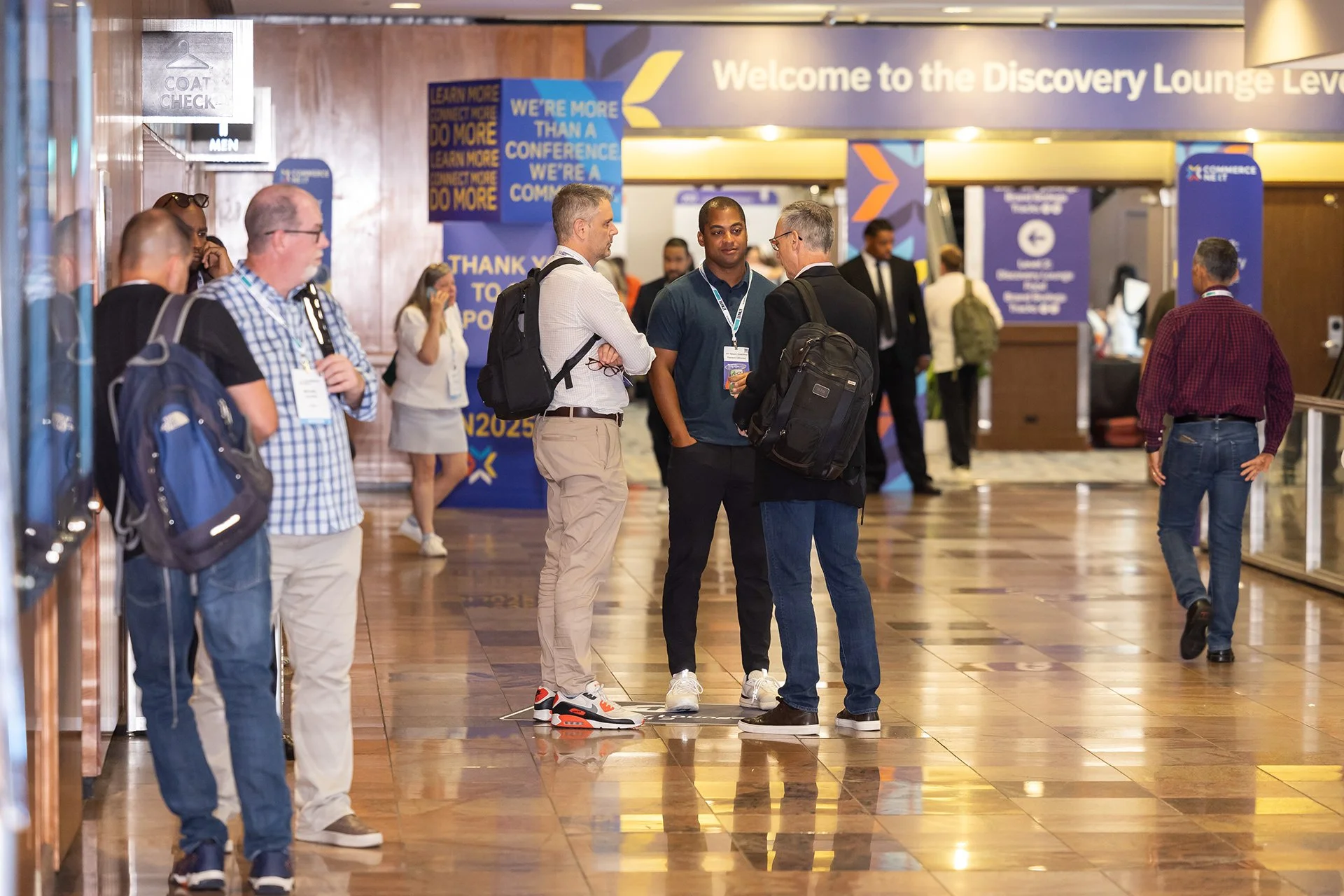
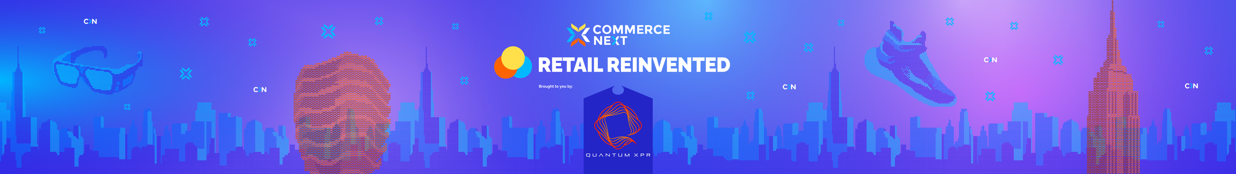
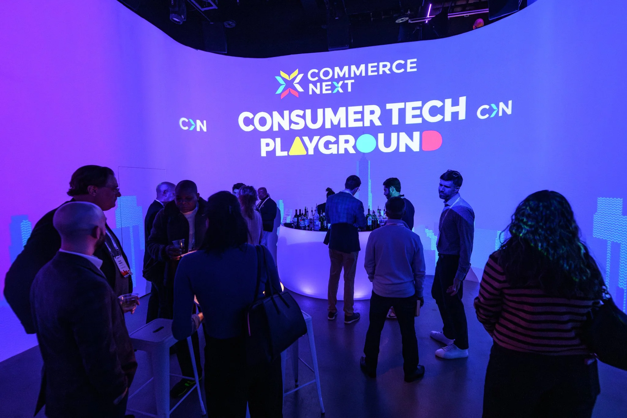
CommerceNext
Client from 2020-2026
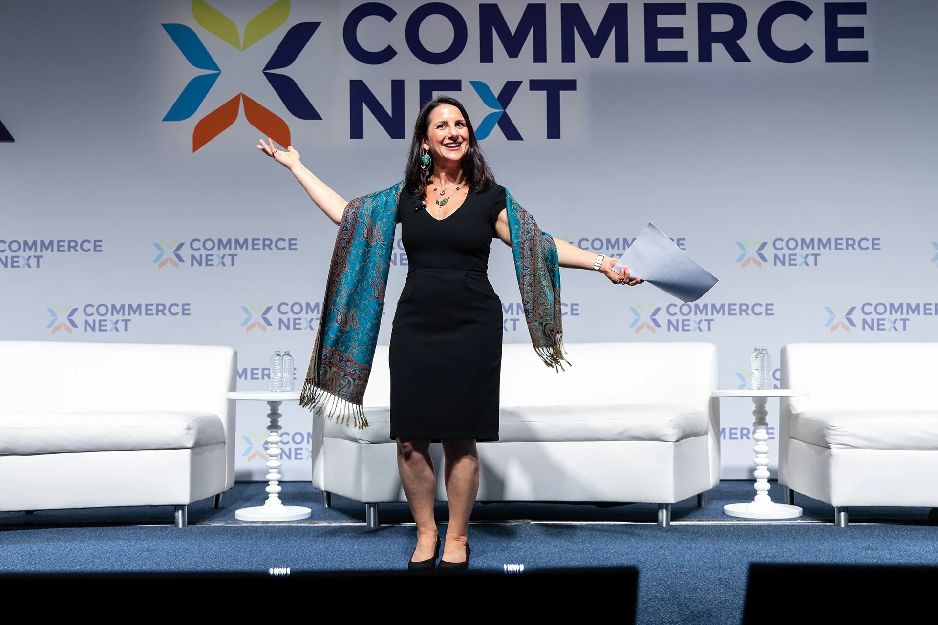
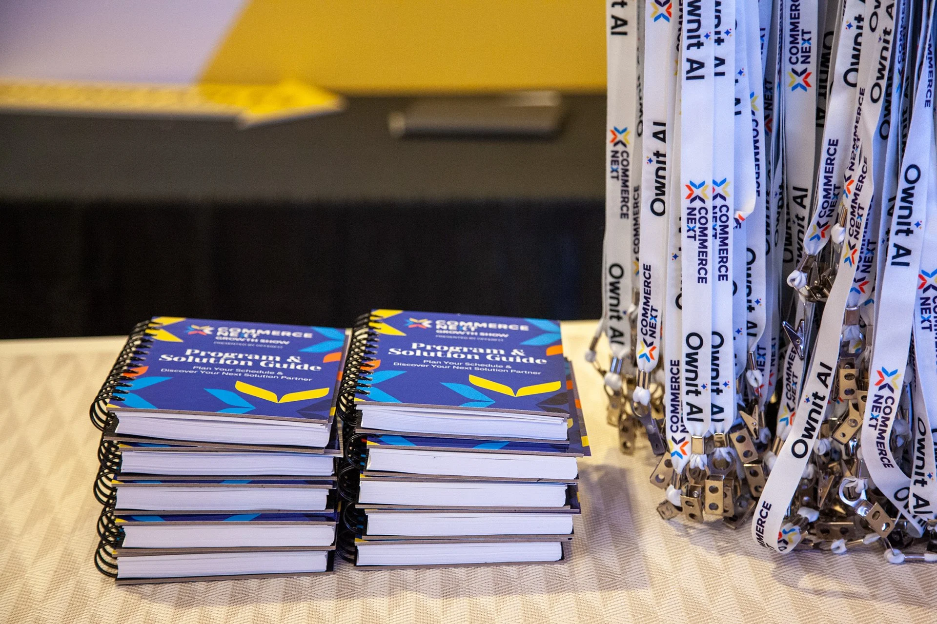
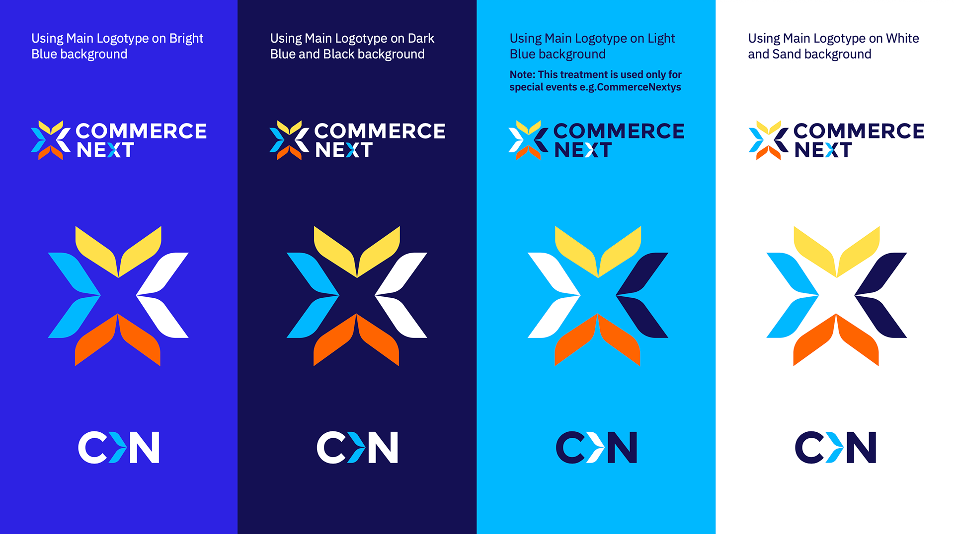
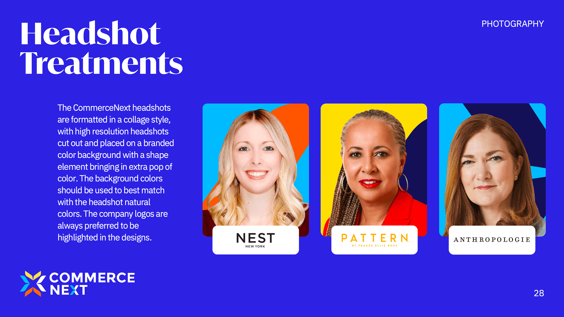
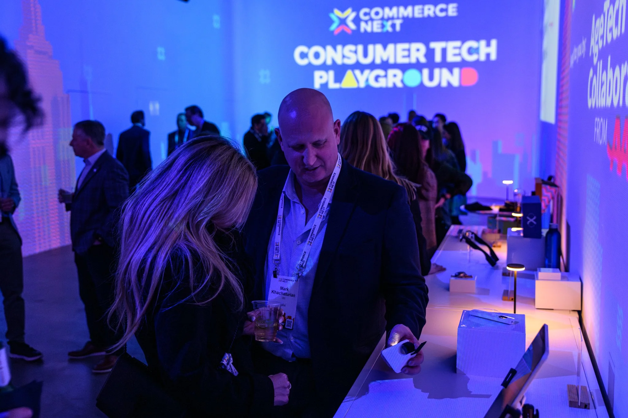
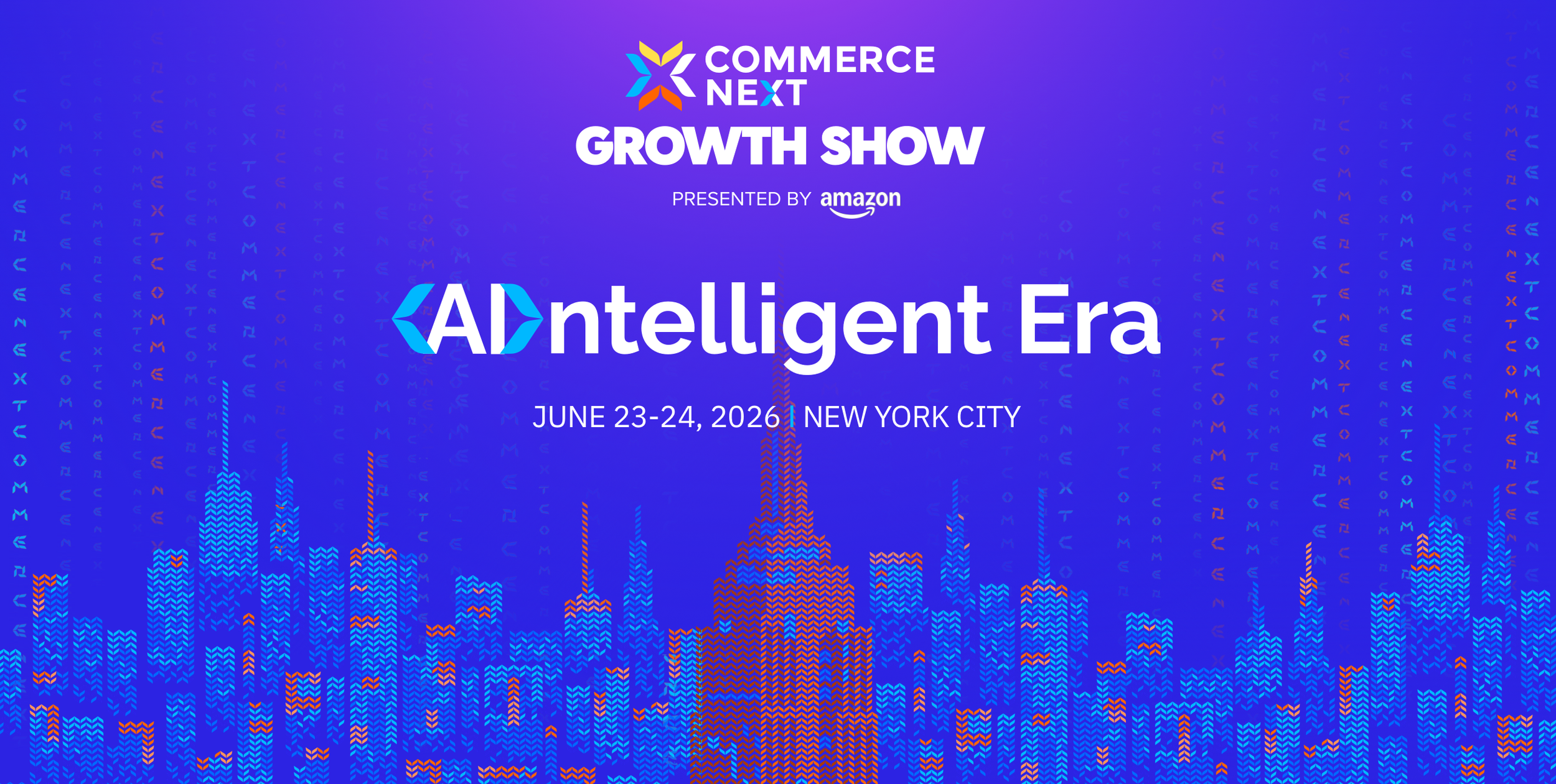
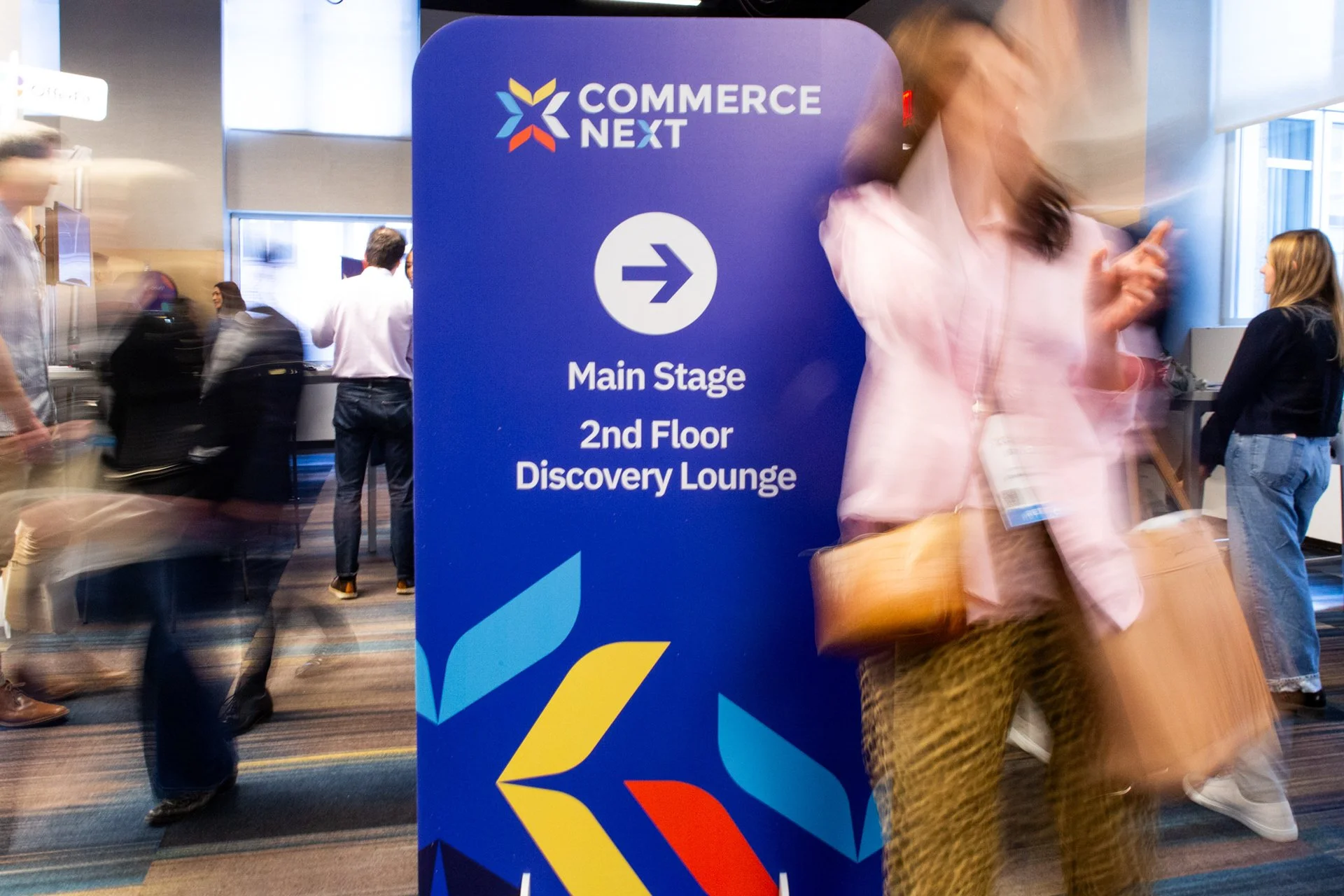
CommerceNext (CN) has been our valued client for six years. As a fast-growing e-commerce conference in New York they need to stay modern to attract their target customers.
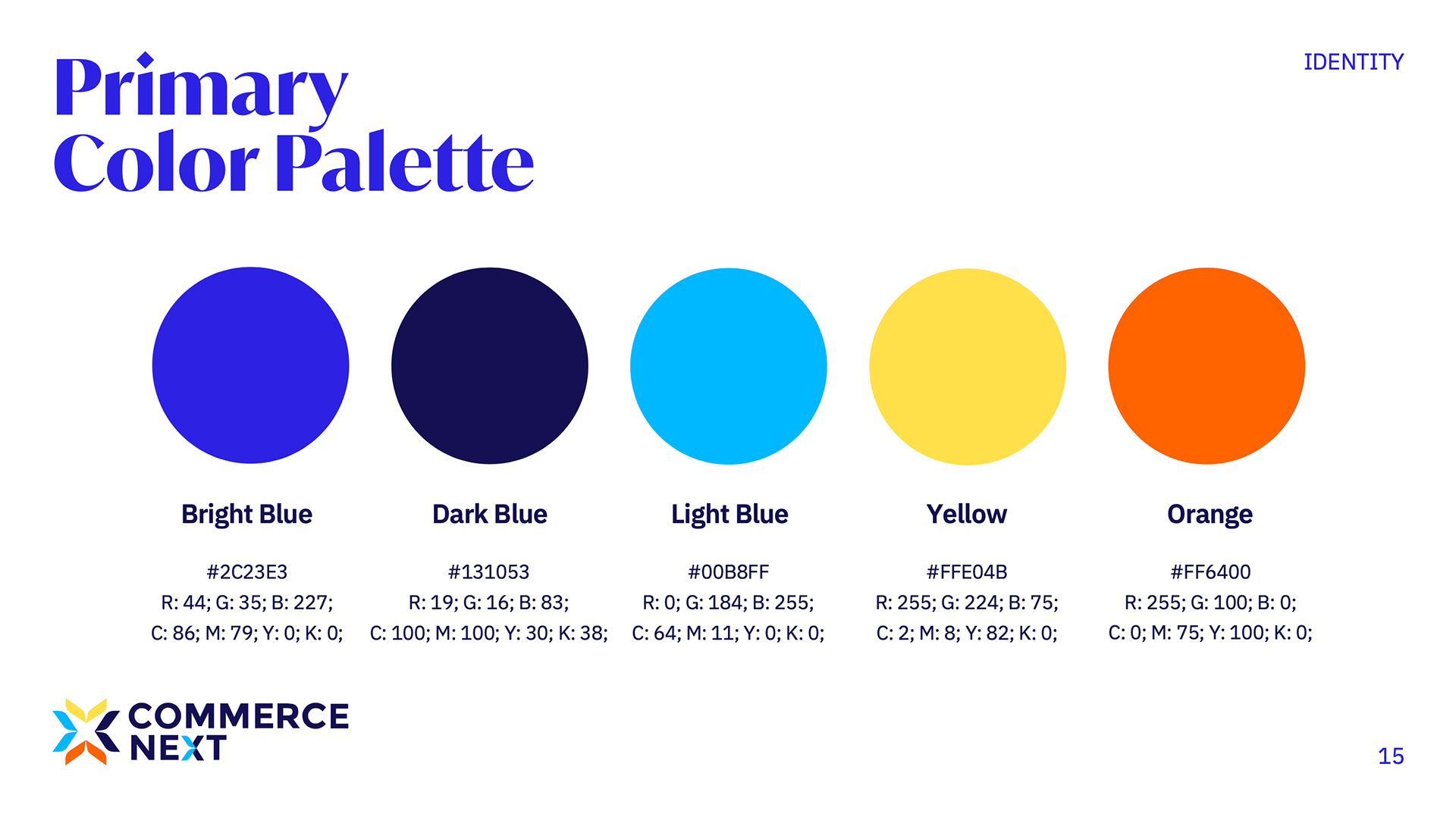
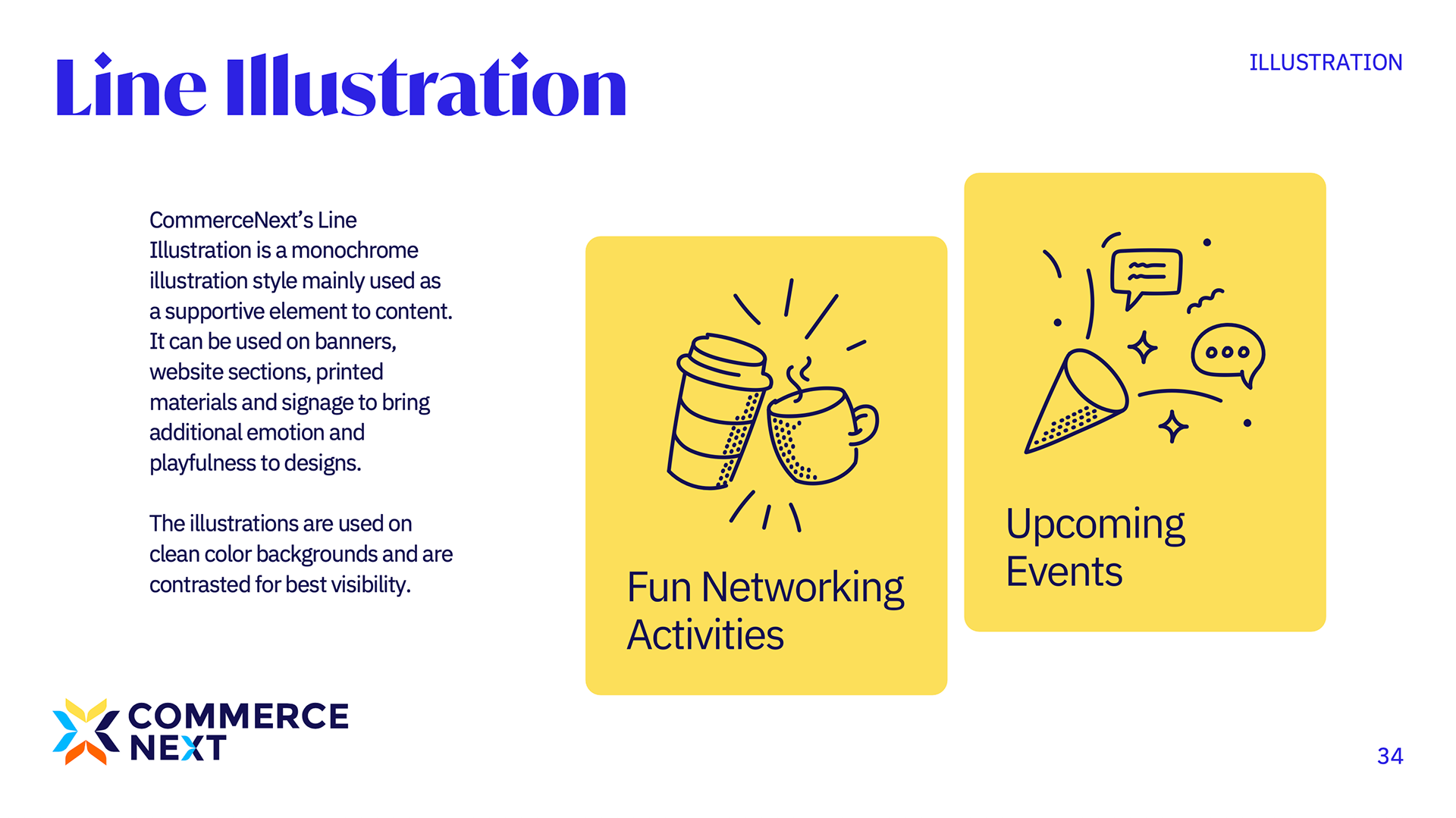
In 2024 we did a full rebrand with a local brand strategist and CN's founding team — refreshing their visual and spoken identity from the ground up. In early 2025 we continued the collaboration, bringing the brand into interactive event spaces with engaging visual design and animations guiding the event.
CN now has a modern, unified brand identity they manage independently — and have continued to grow their conference year on year.

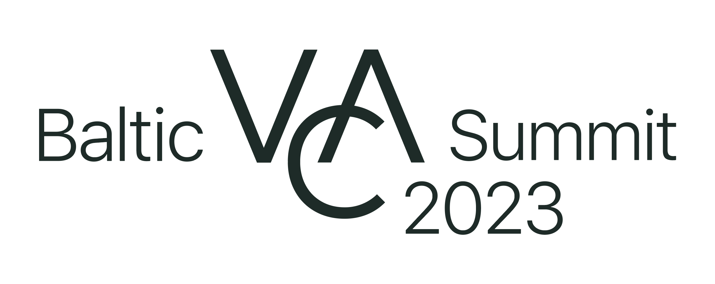
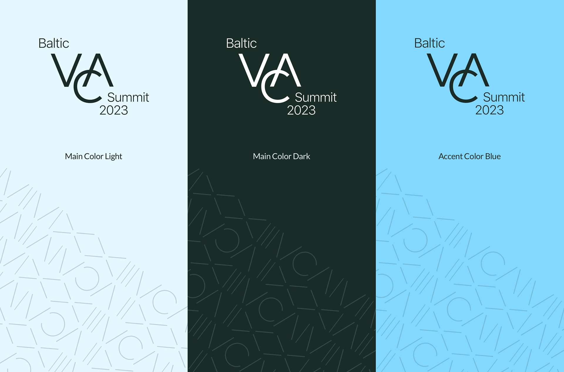
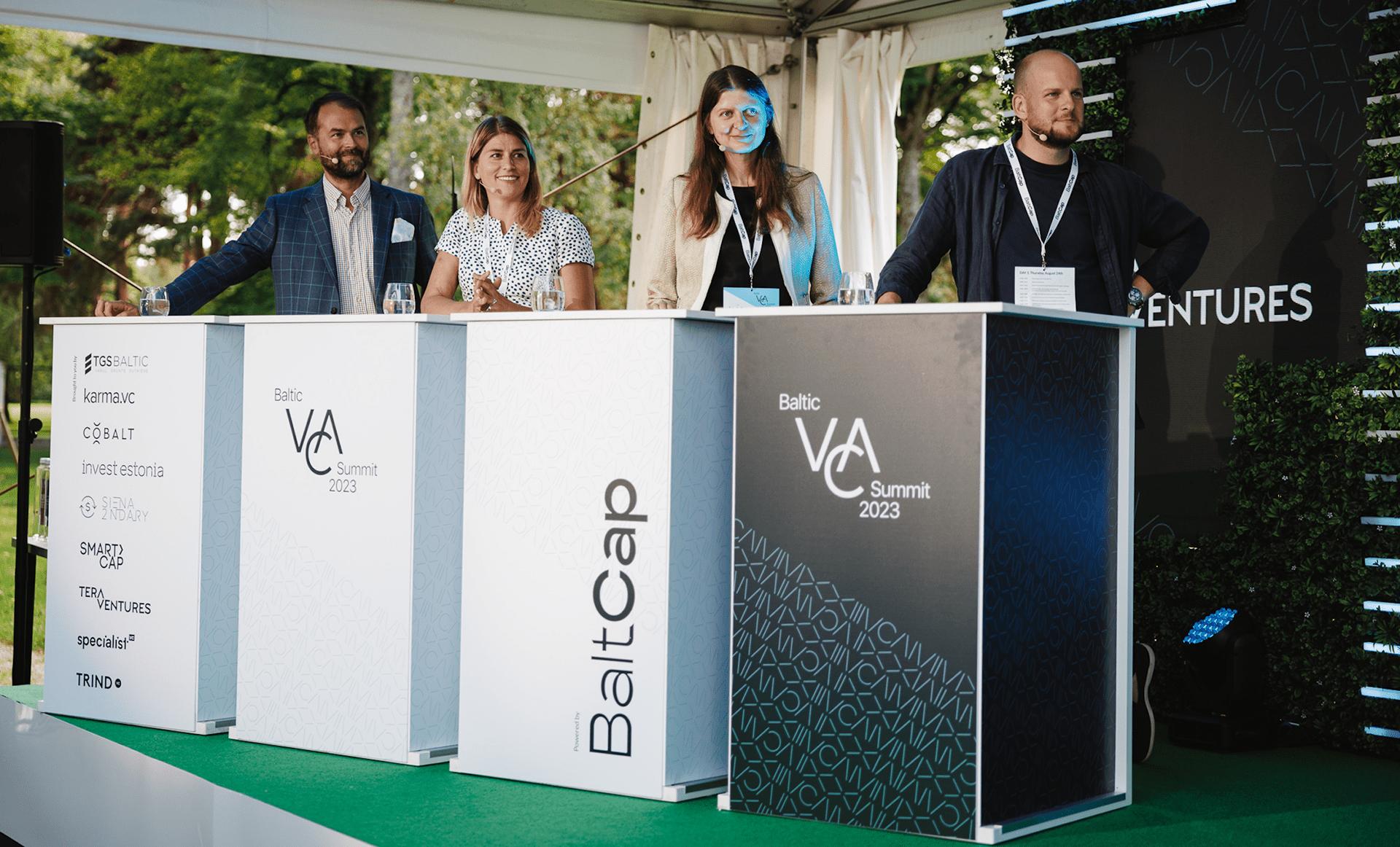
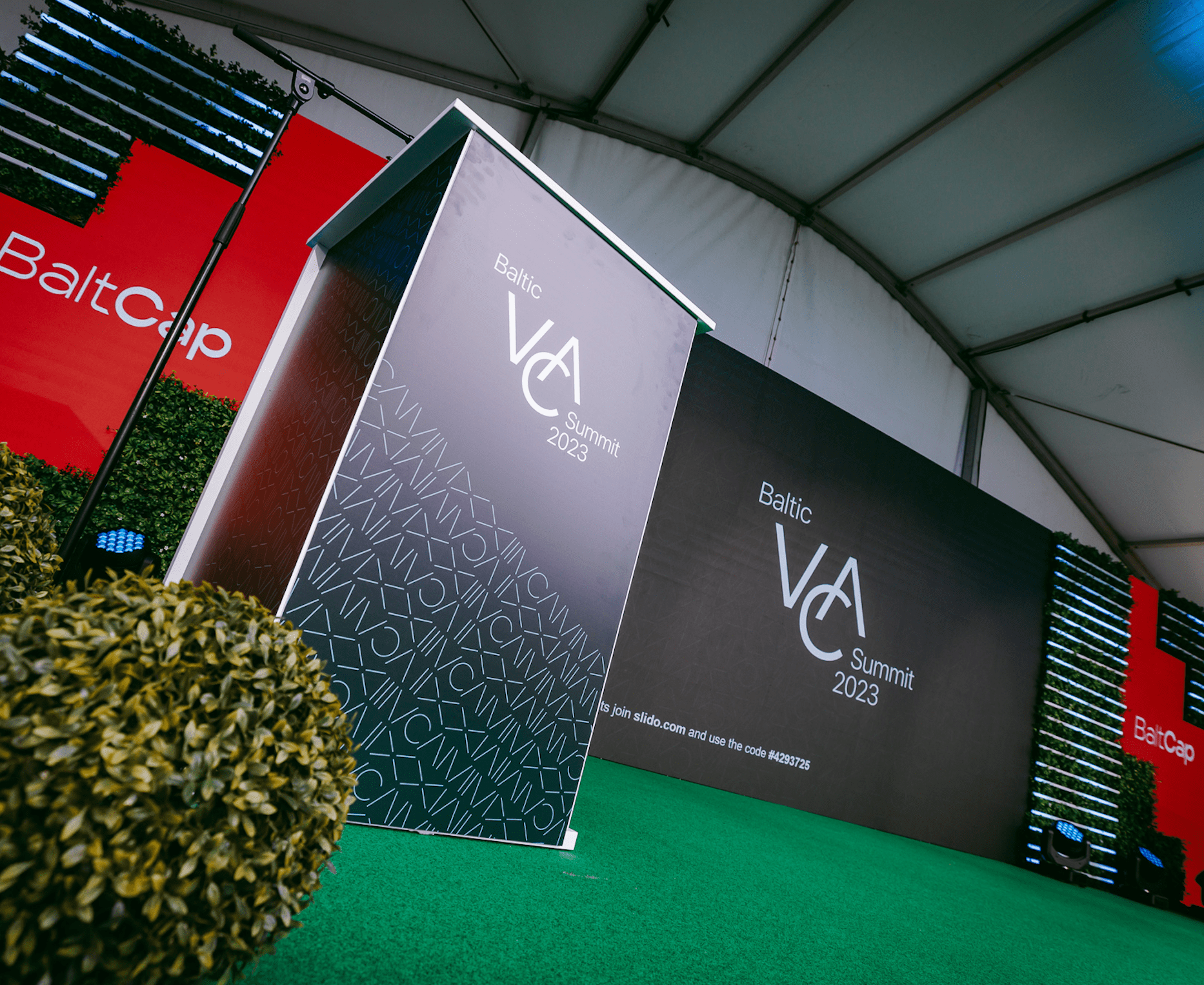
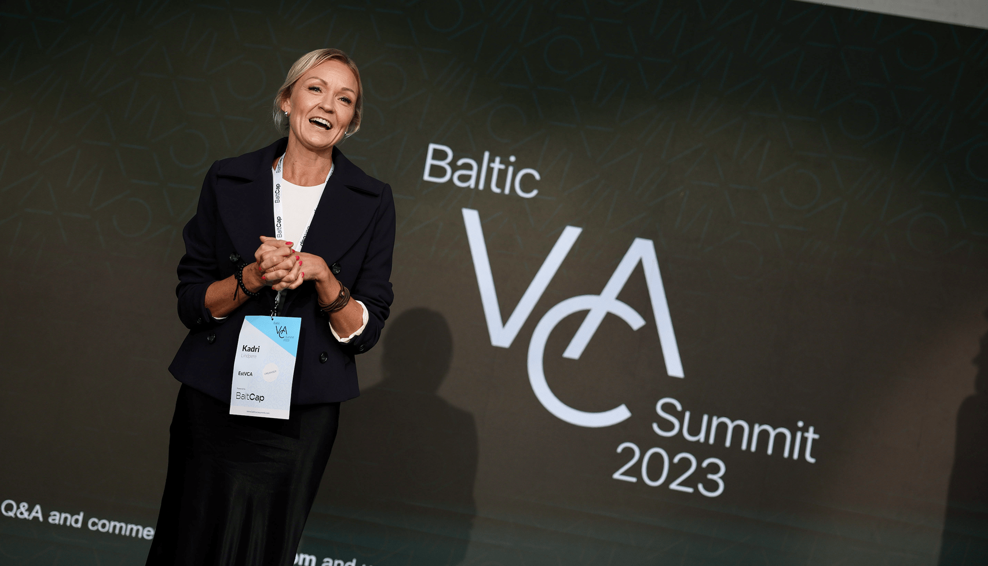
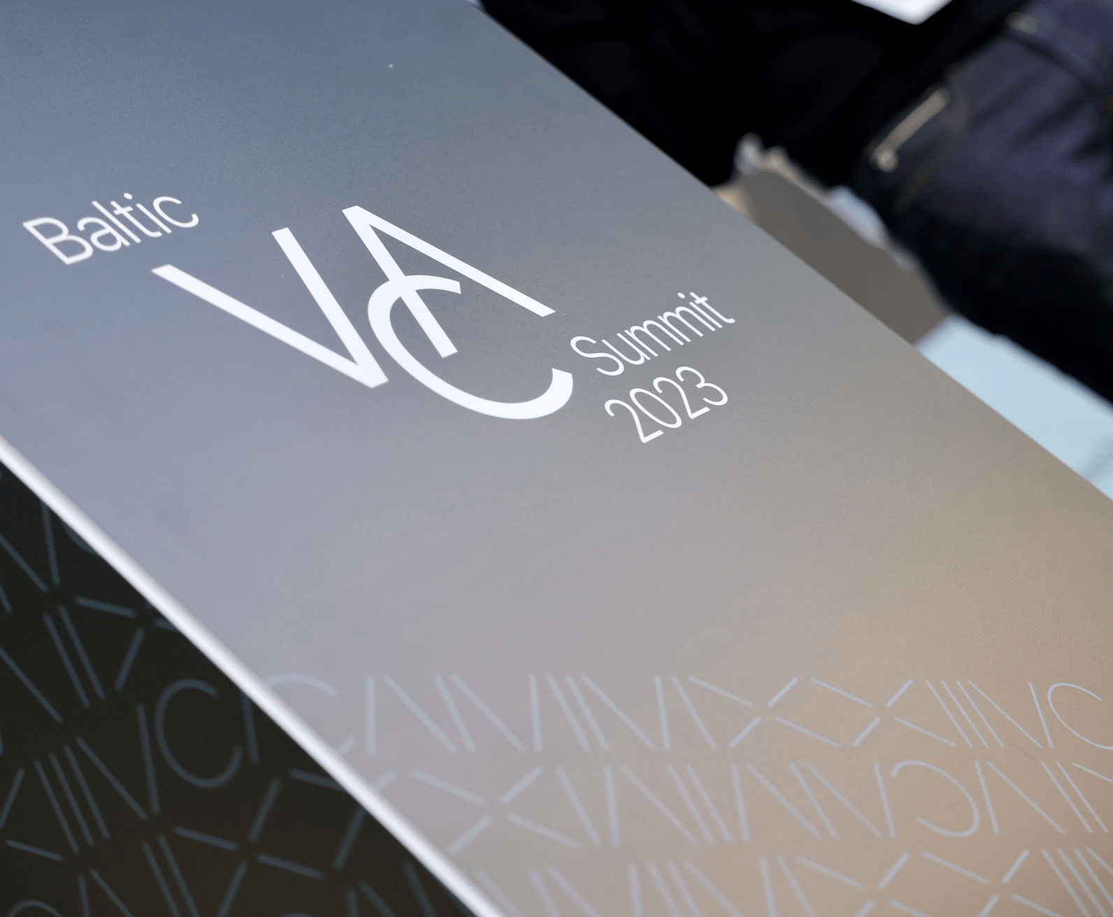
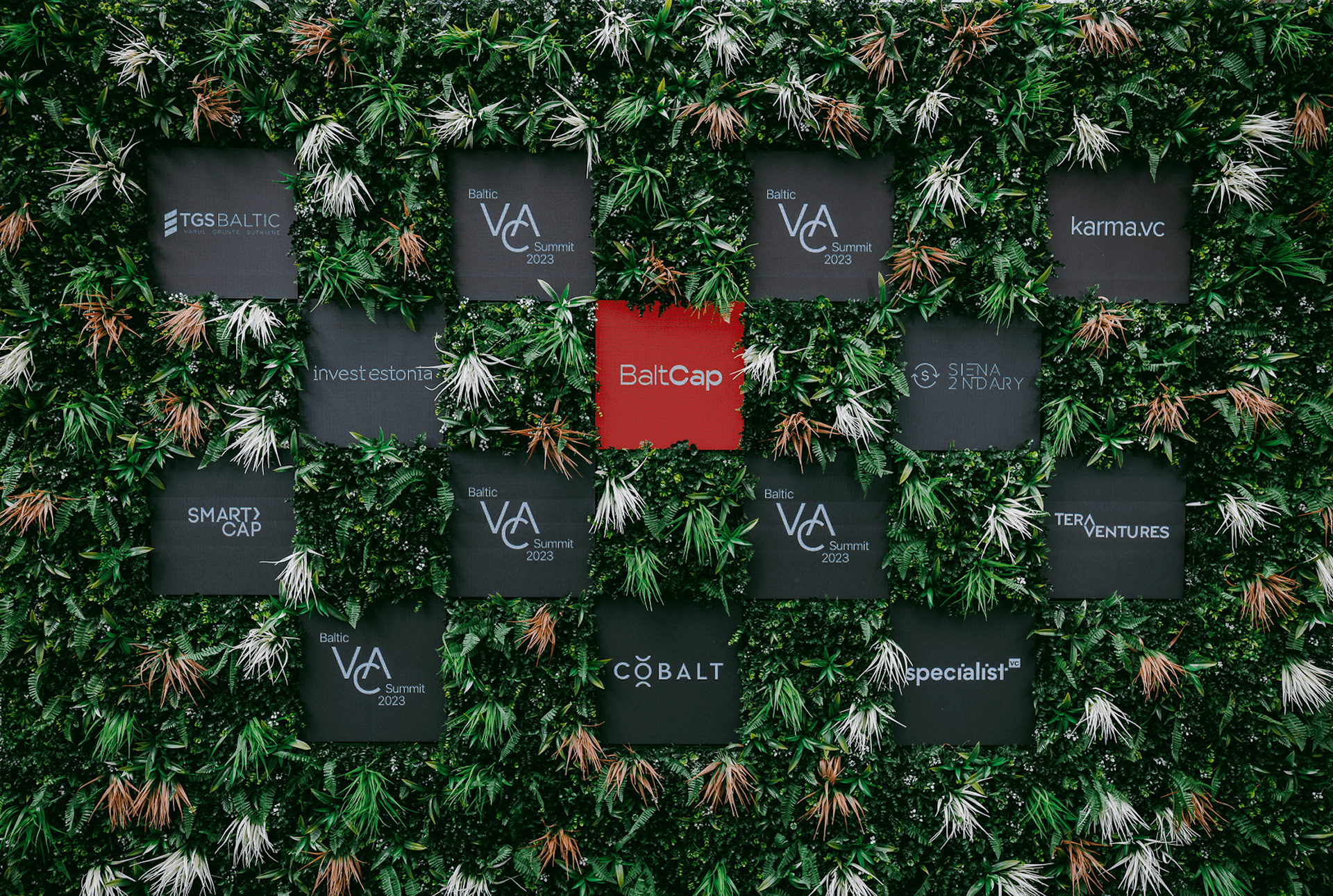
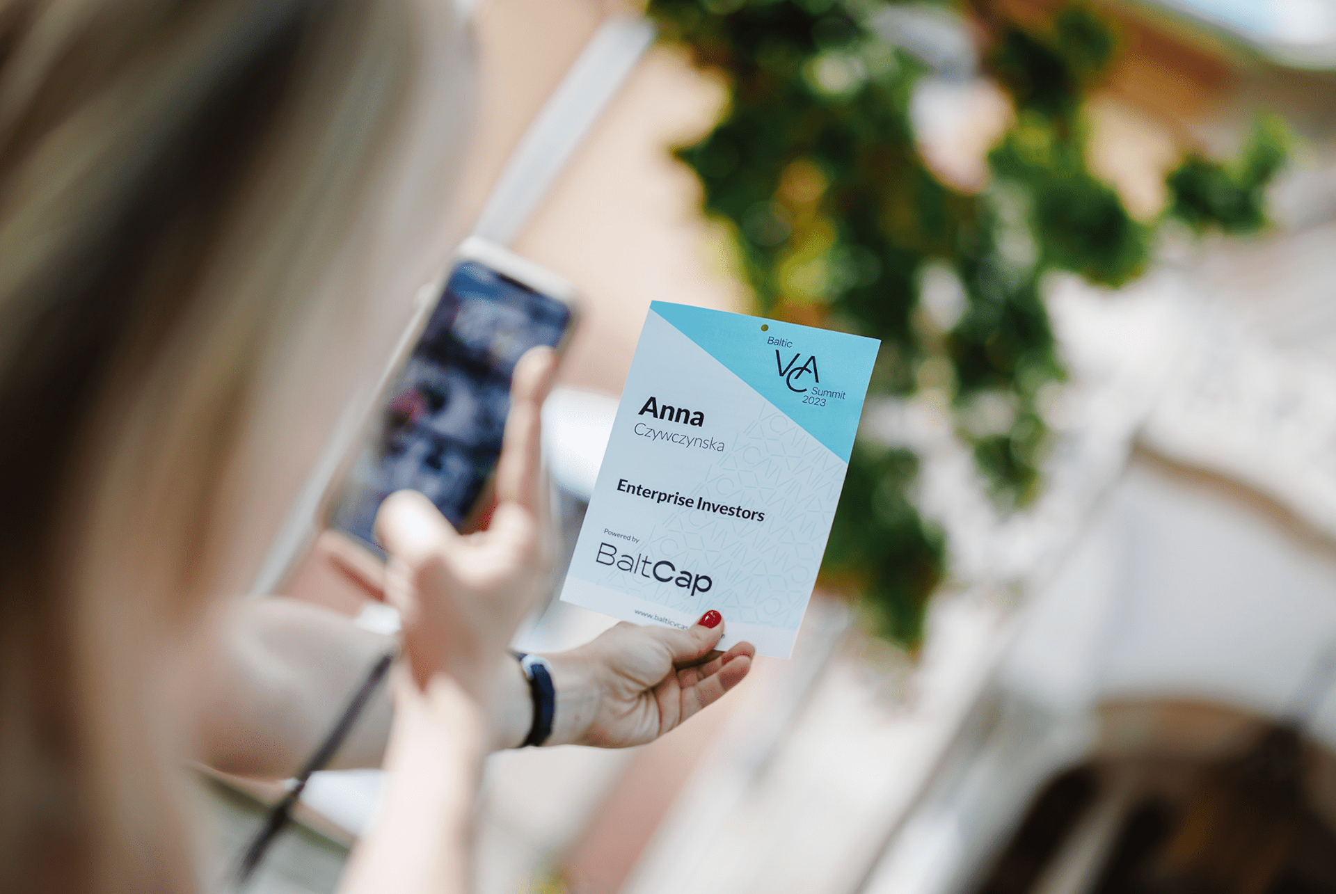
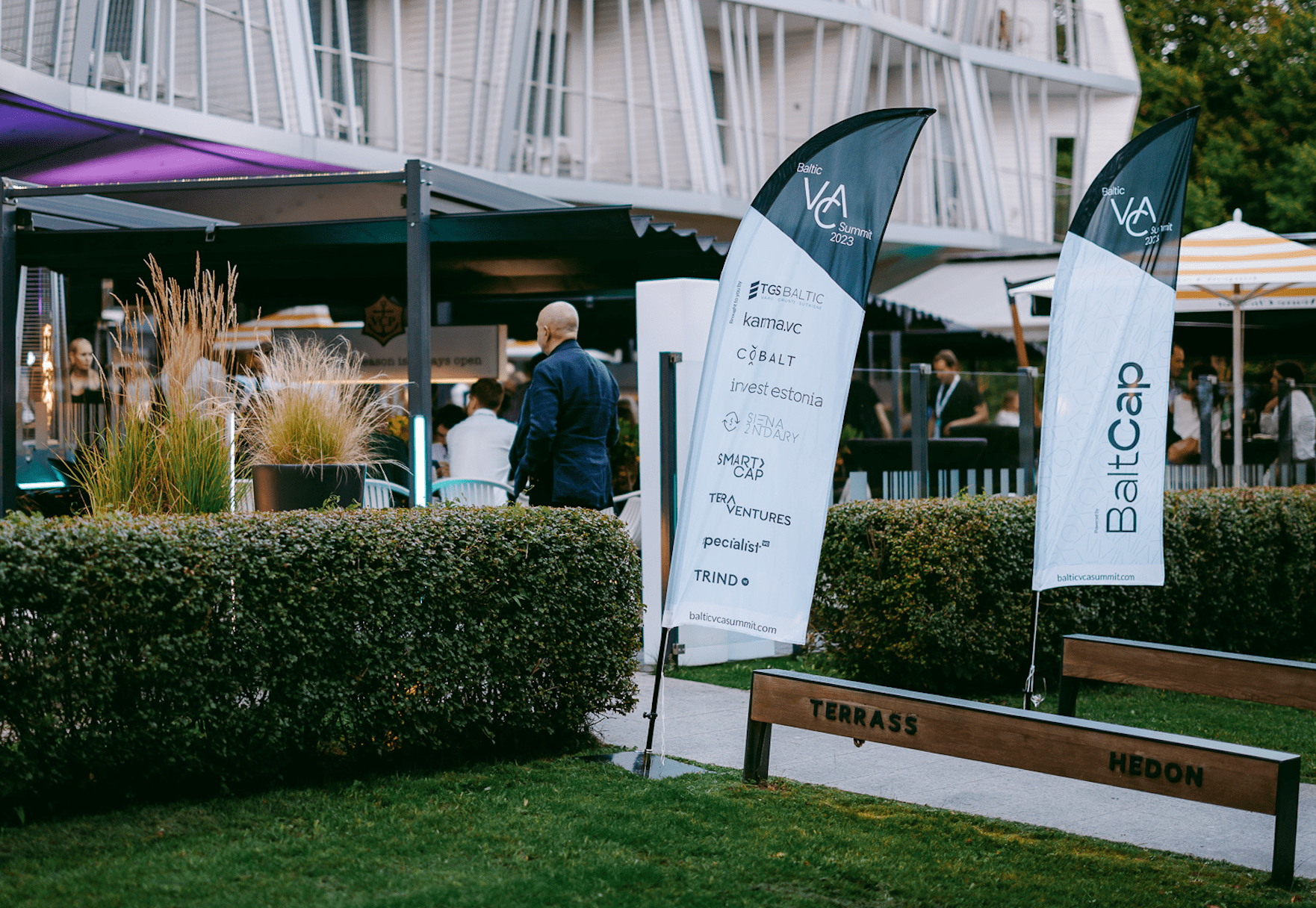
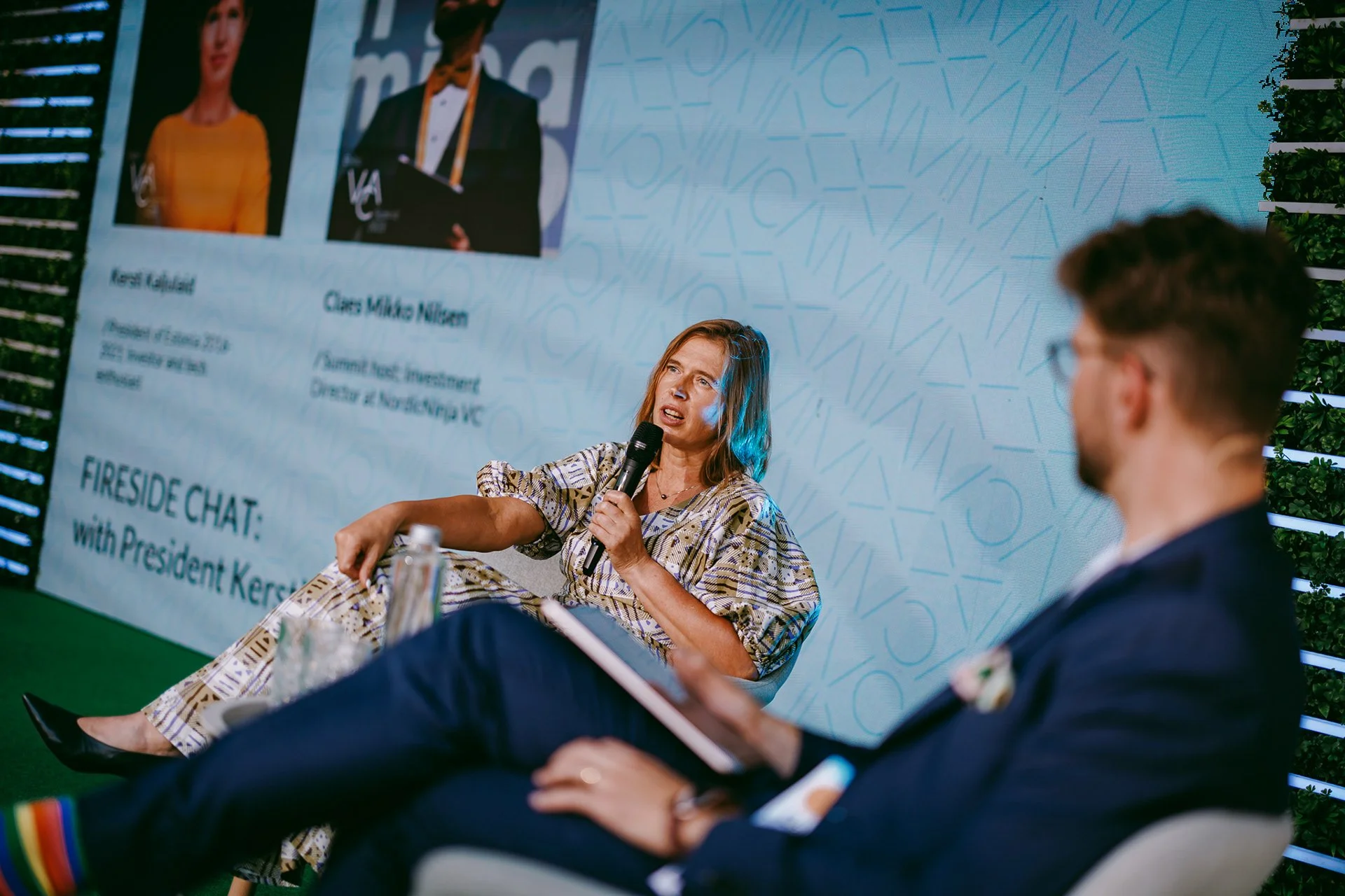
Baltic VCA Summit
Client from 2023-2026
Baltic VCA Summit is an annual gathering bringing together over 300 investors and VCs in the Baltics. As the summit hadn’t had a consistent brand identity thoughout the years we were challenged to create a memorable visual identity with clean and modern aesthetic.
Together with the fresh look we created a brand new website and various printed and digital materials to support the physical event.
We accomplished a unique and memorable brand identity that can refresh itself throughout the years but carry the same timeless style.
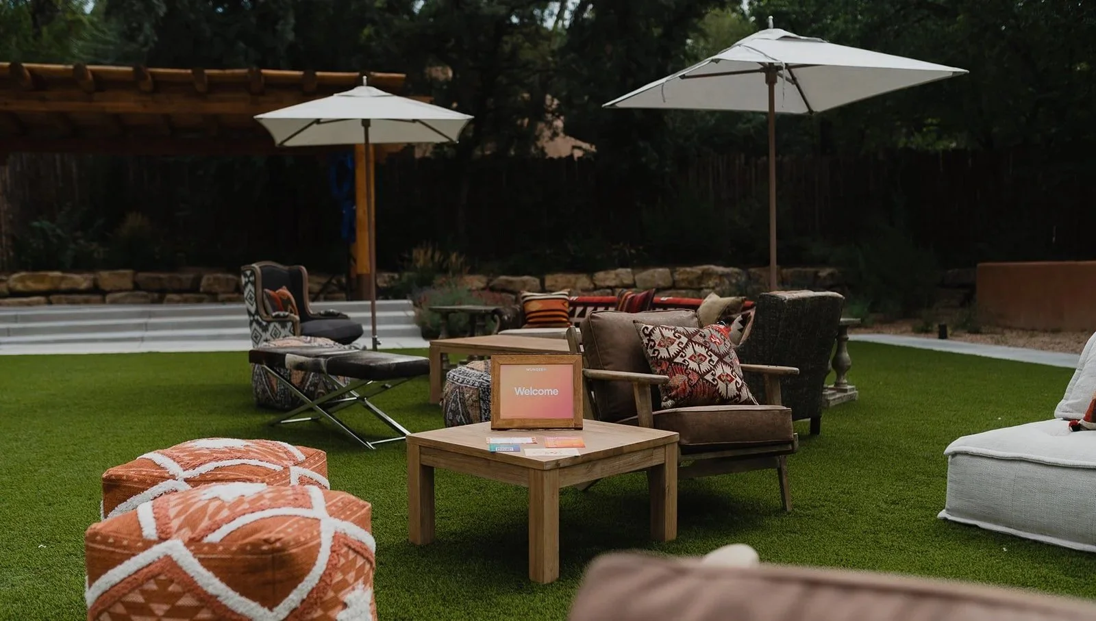
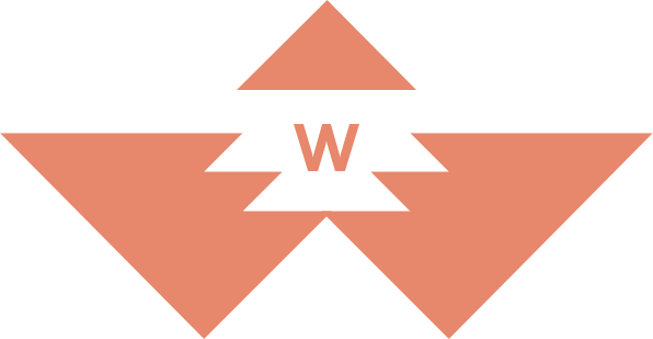
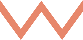
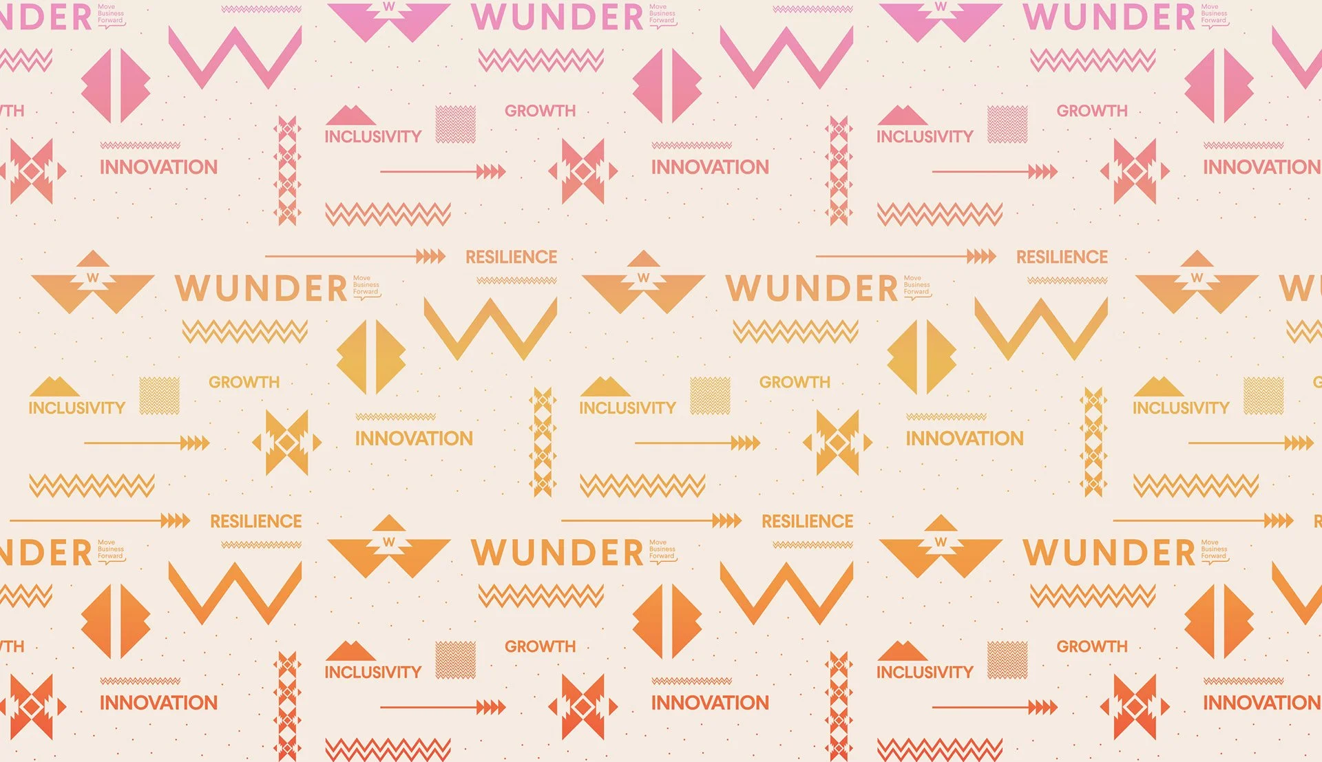
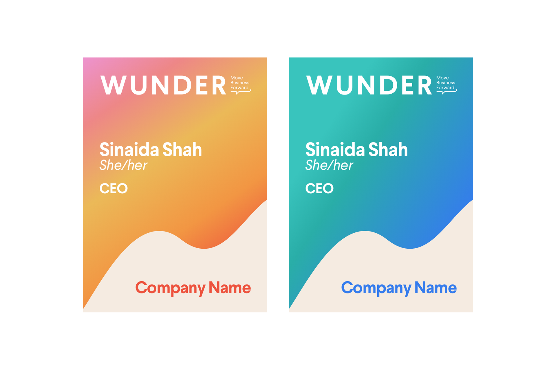
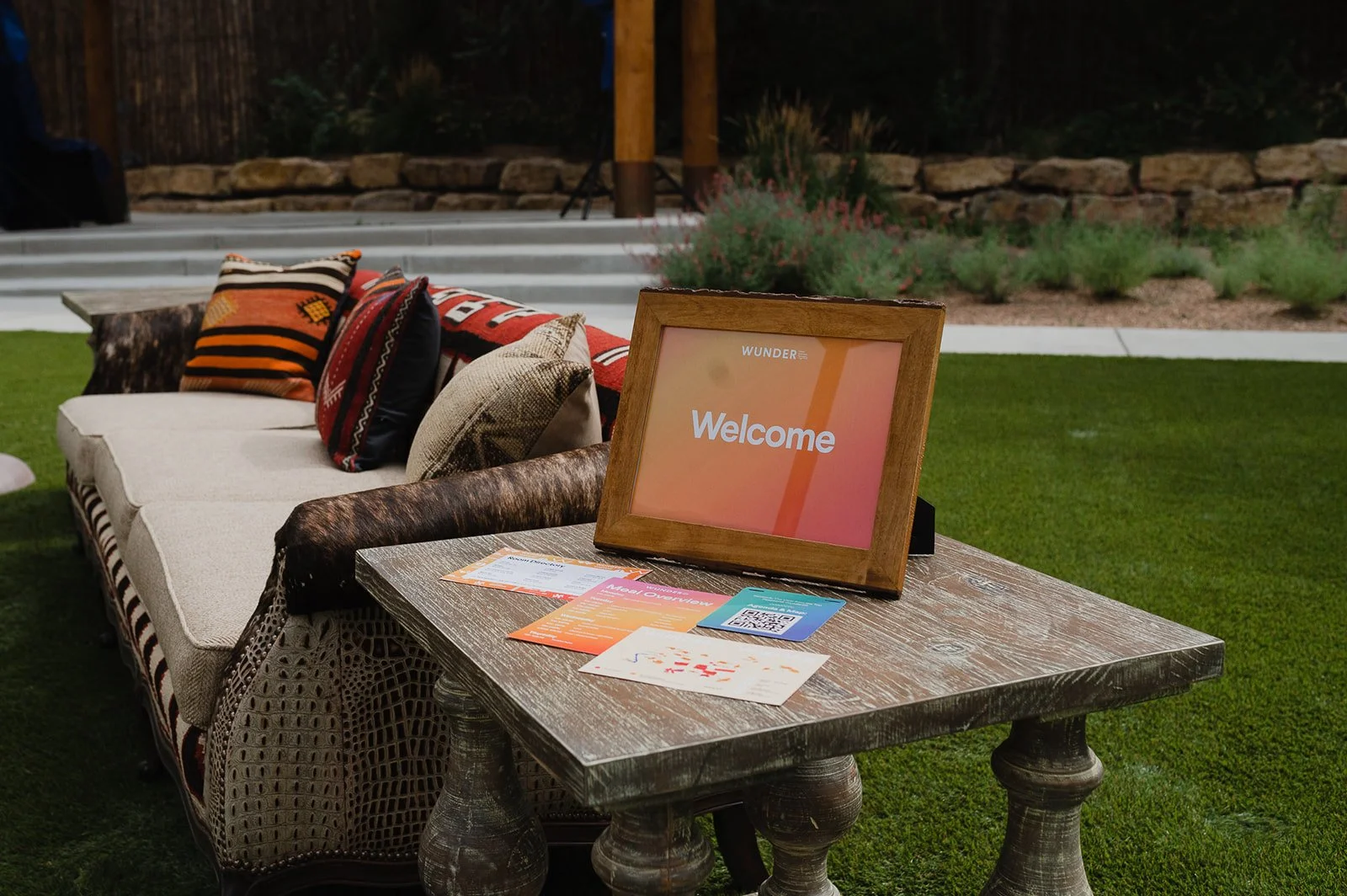
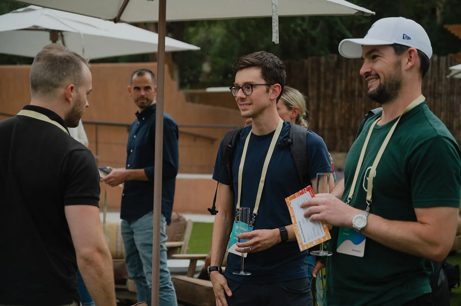
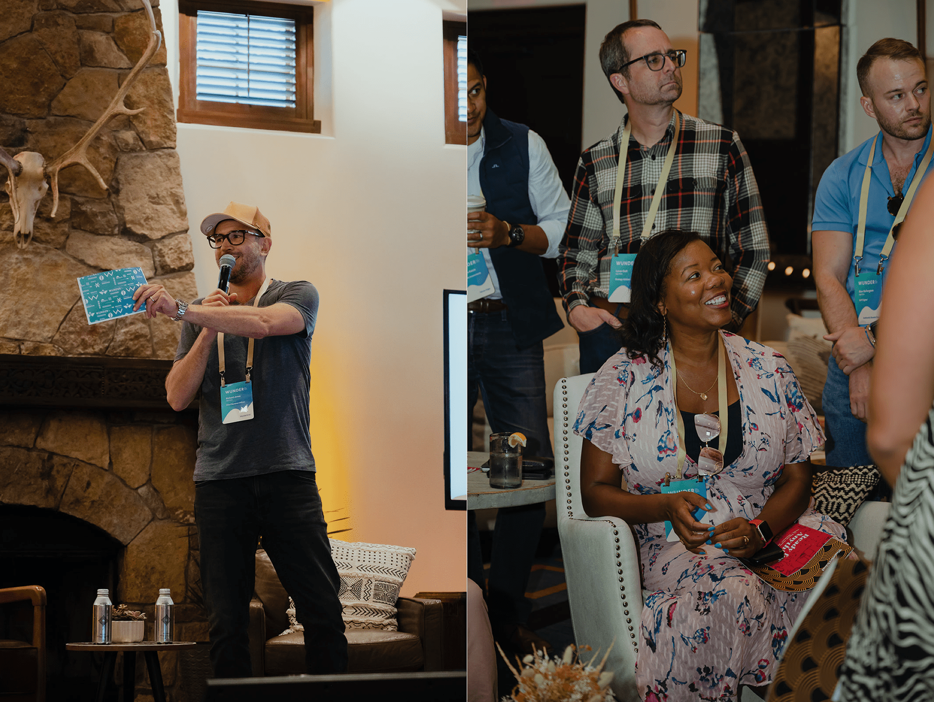
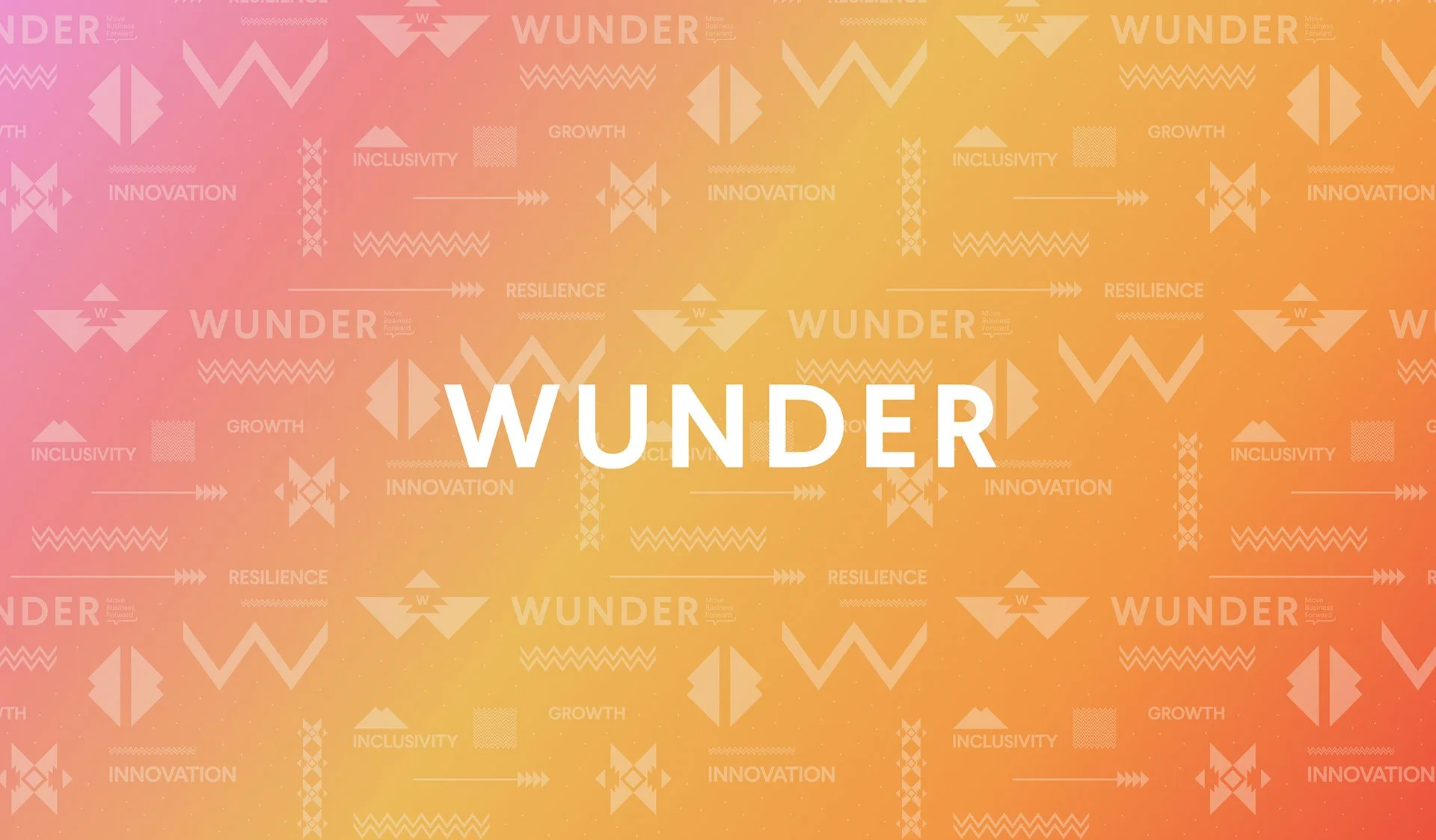
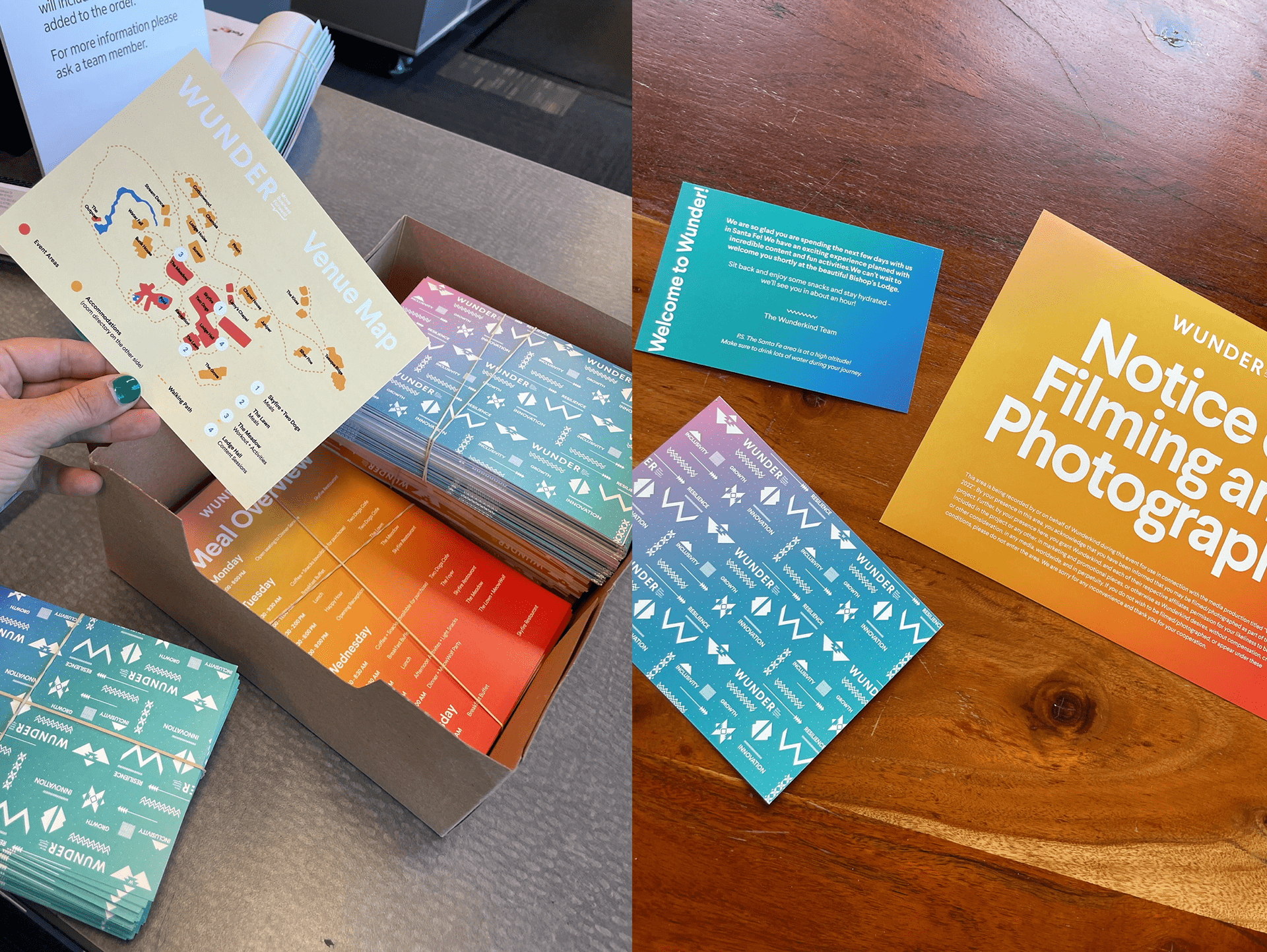
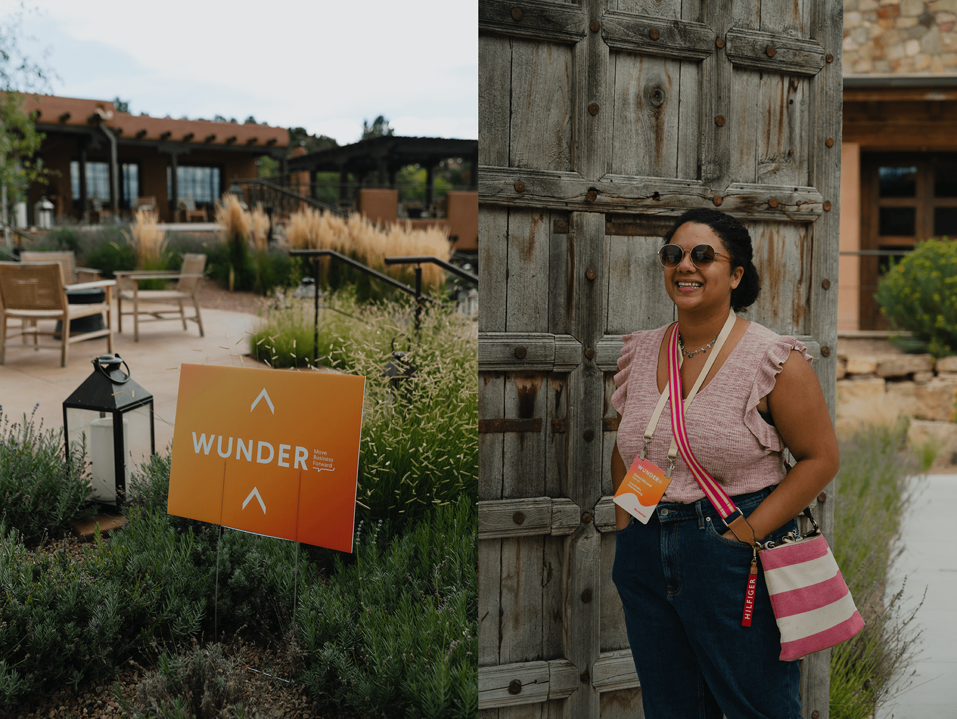
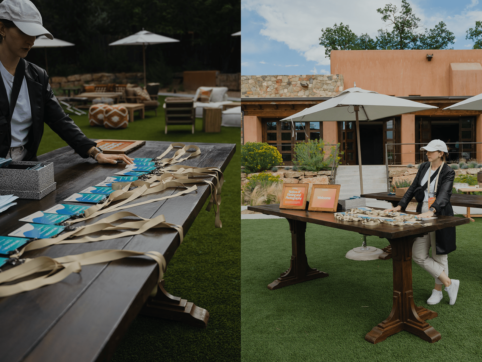
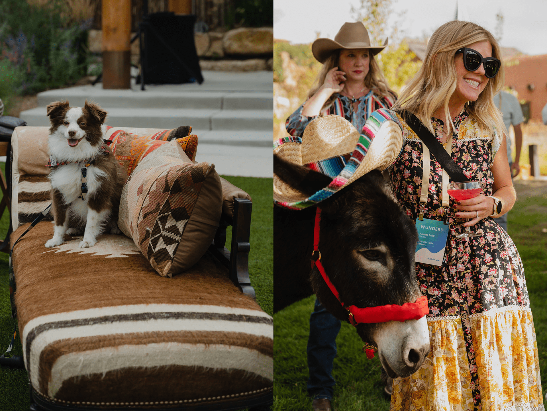
Wunderkind
WUNDER was Wunderkind's exclusive in-house summit for their most valued customers. The event needed a distinct visual identity that bridged the innovative spirit of the conference with the luxury of the New Mexican resort where it took place.
Drawing inspiration from authentic New Mexican design elements and Wunderkind's own 'W' symbol, we created a unique pattern system that carried through every touchpoint. Together with the production team we designed the full venue experience — venue maps, personal invitation cards, badges, and all supporting materials.
We accomplished a versatile and elegant visual identity that felt completely at home between the New Mexican sky and mountains — and that guests couldn't stop talking about.
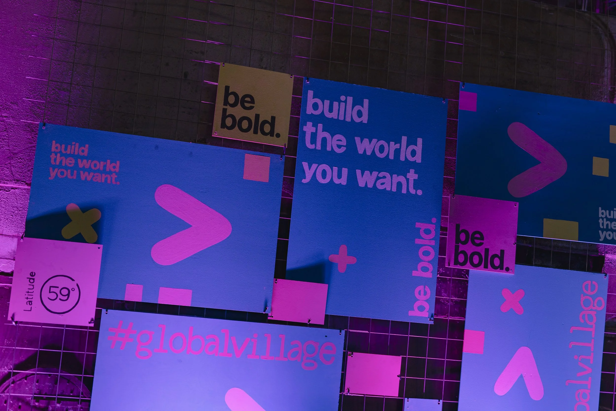
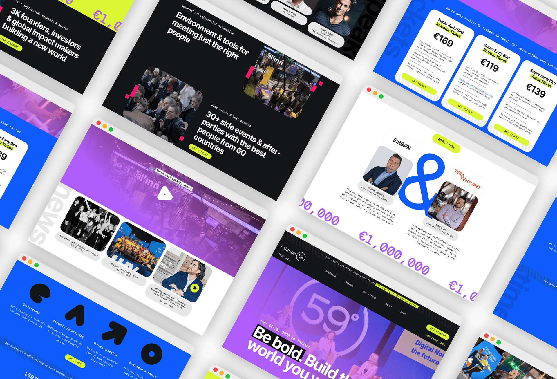
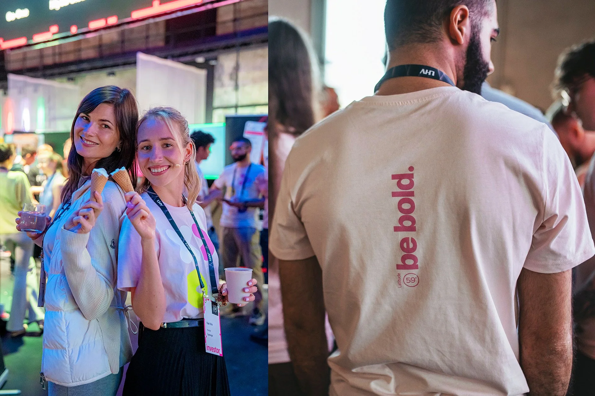
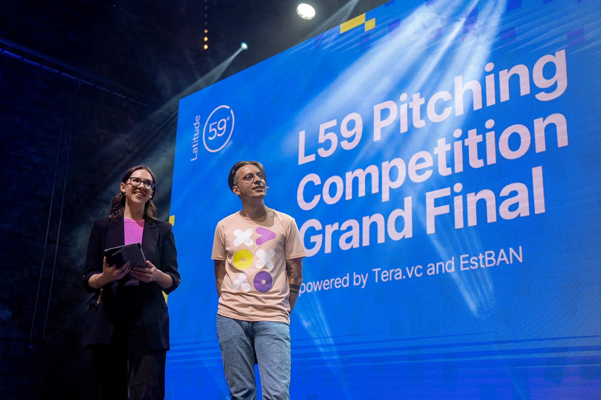
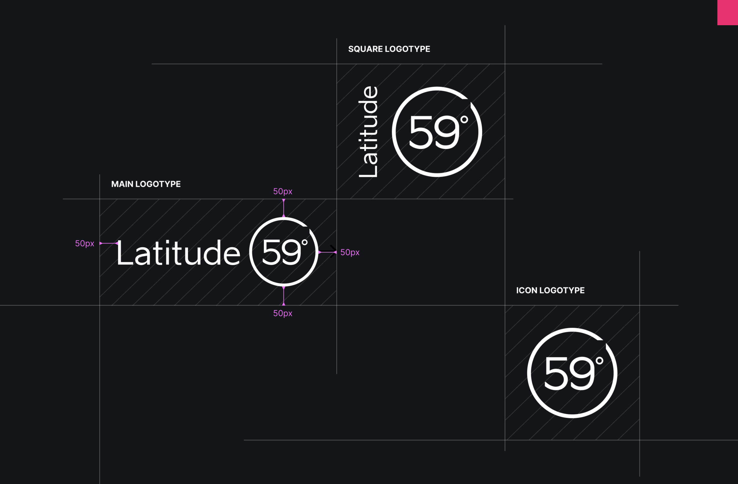
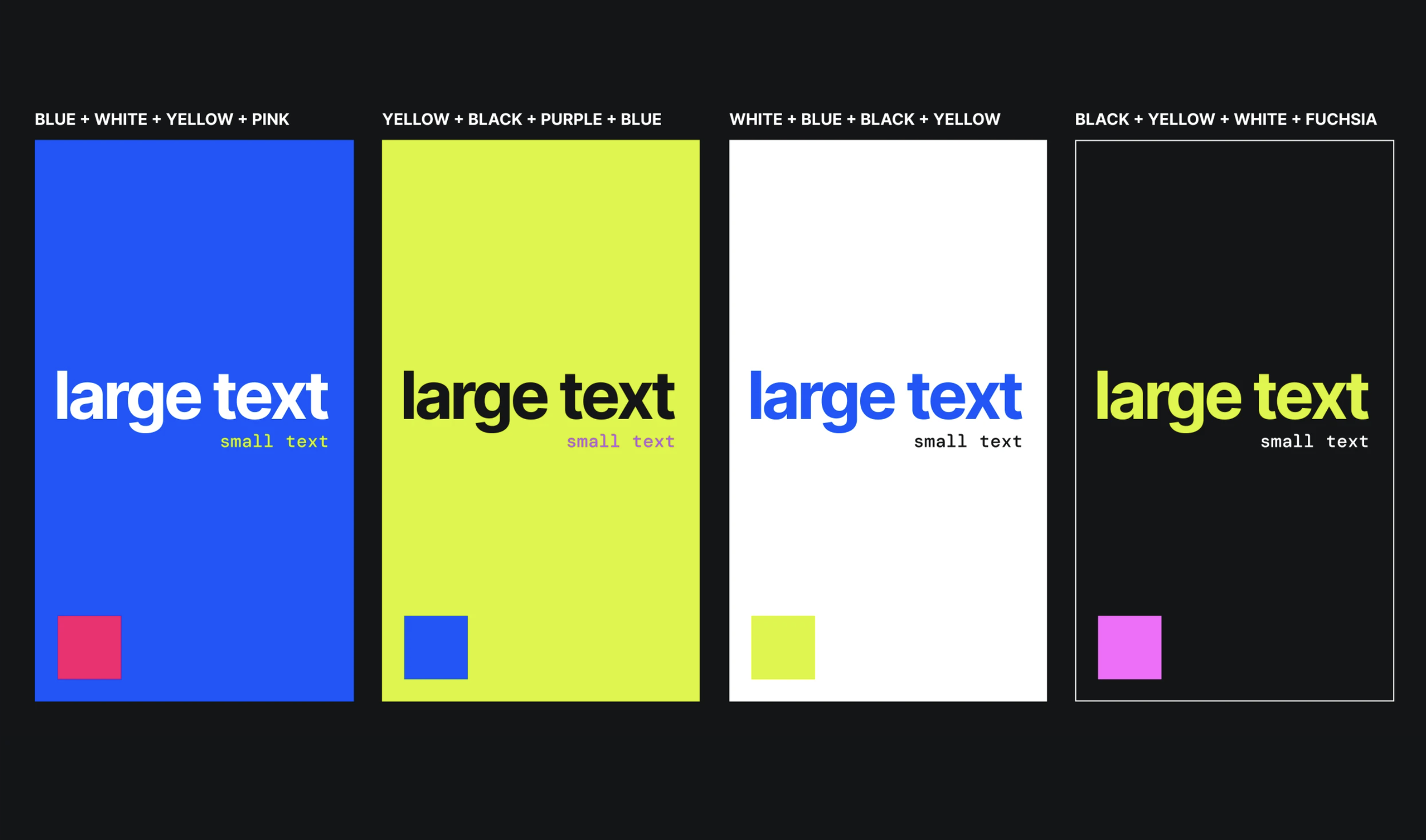
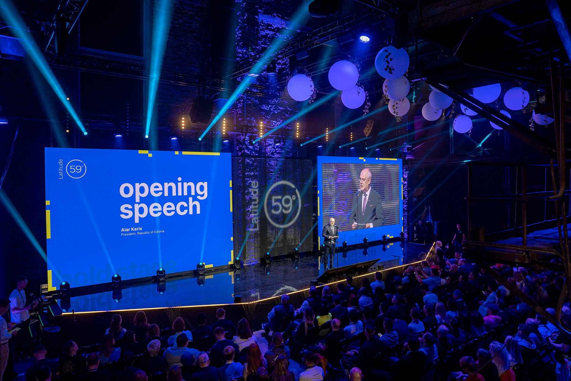
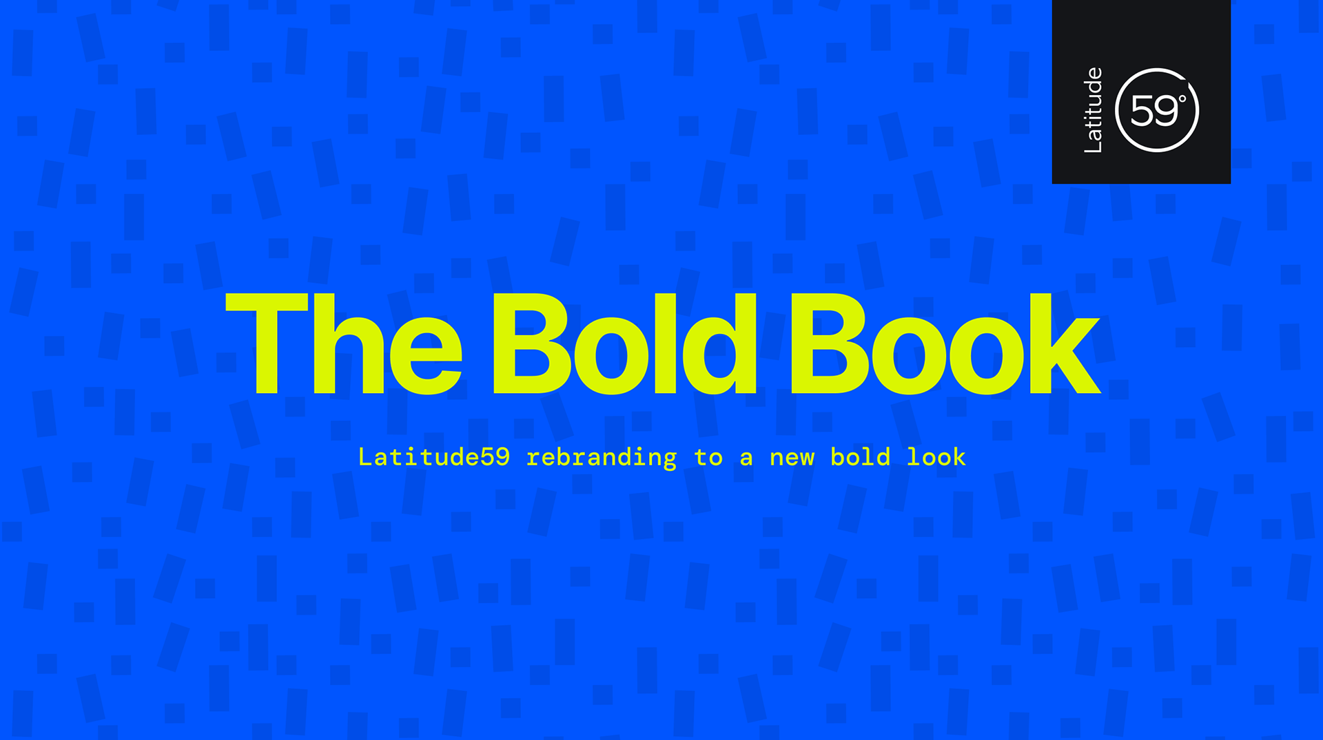
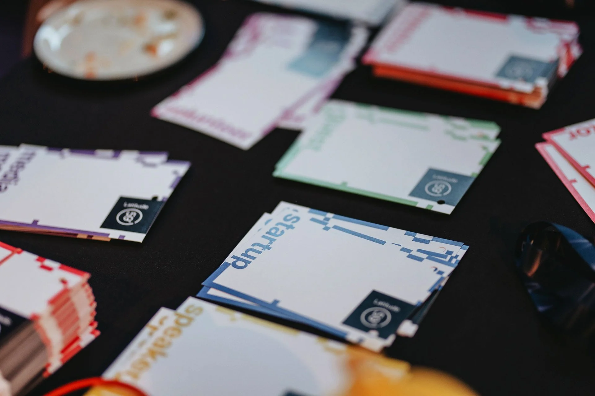
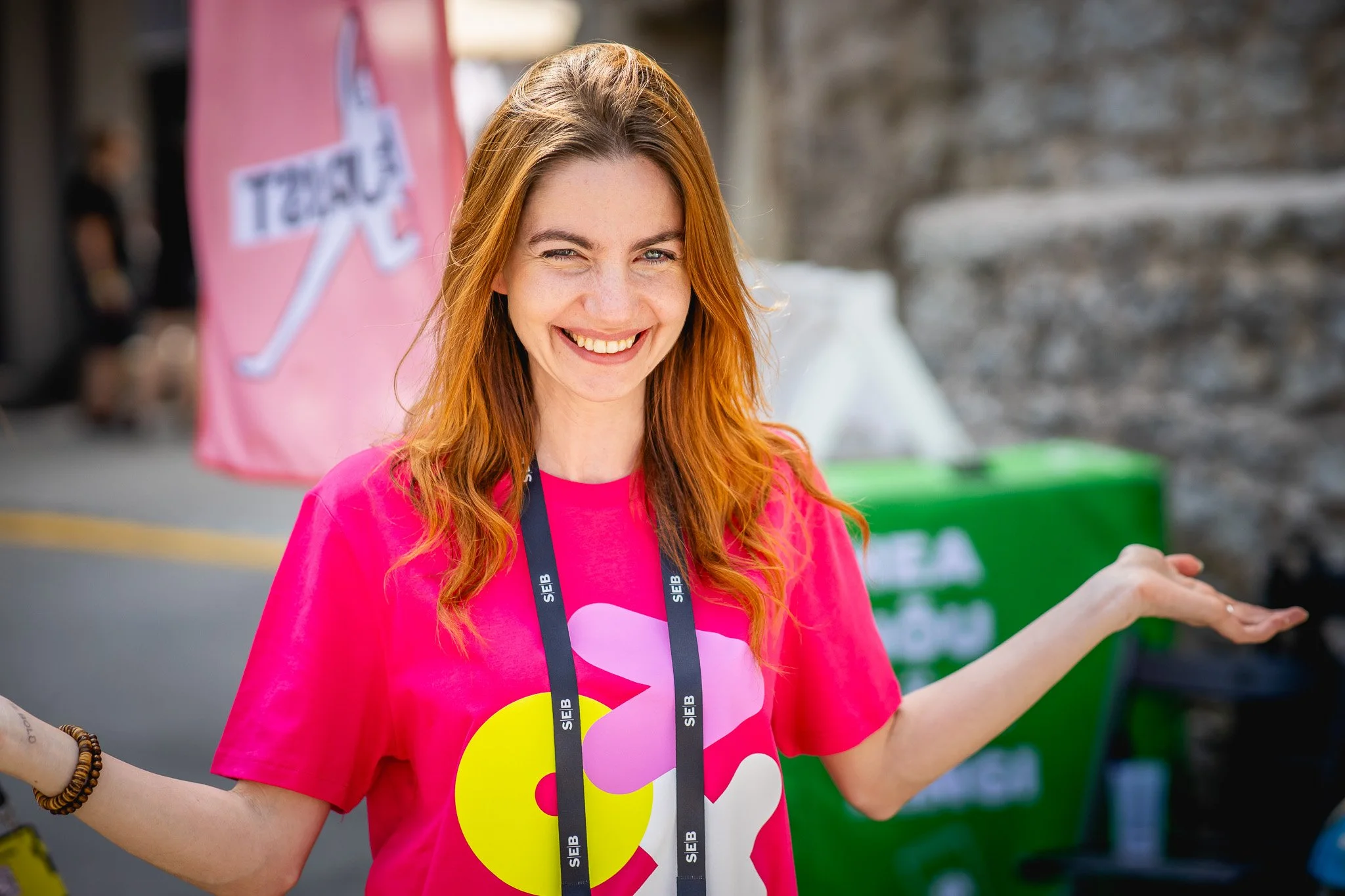
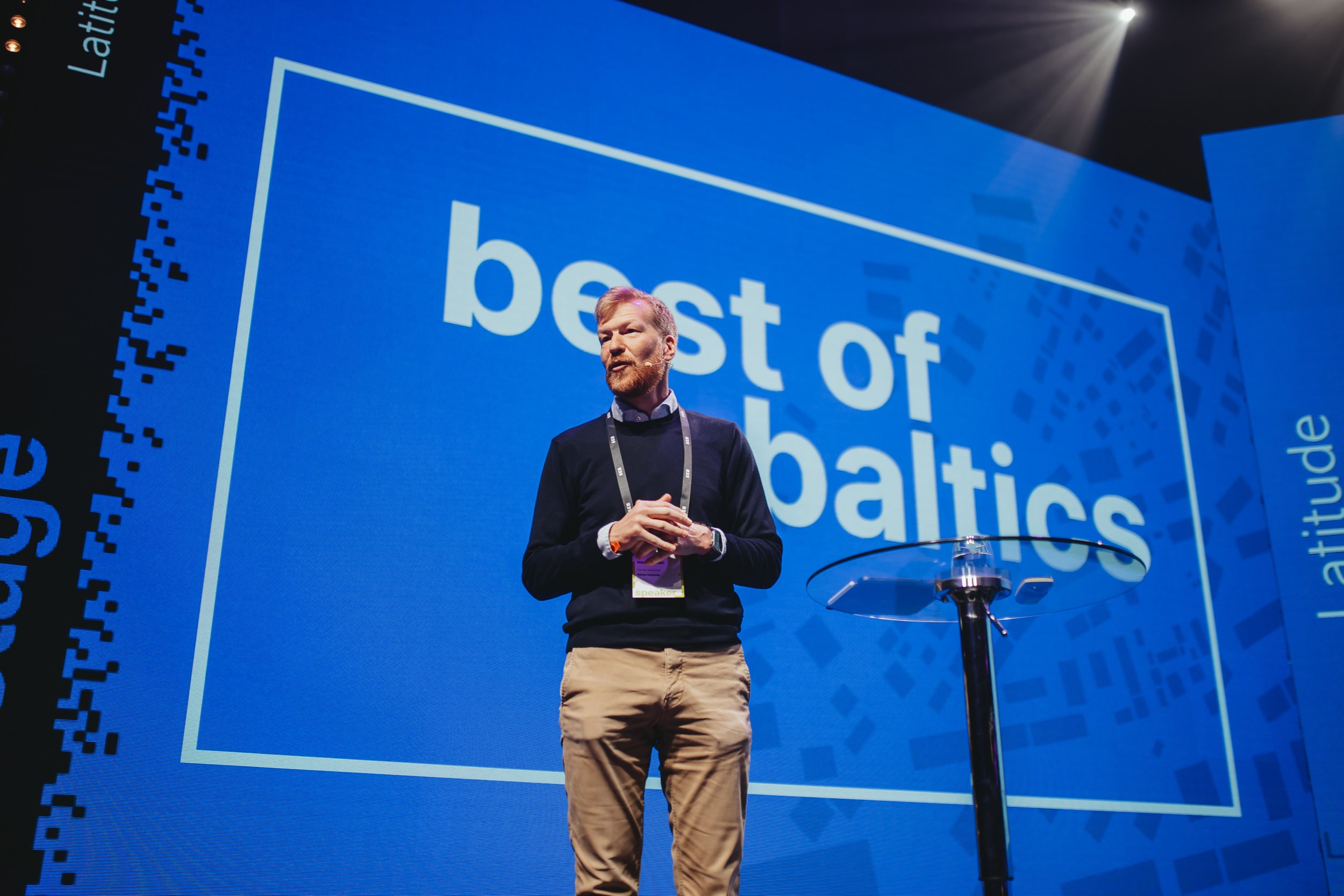
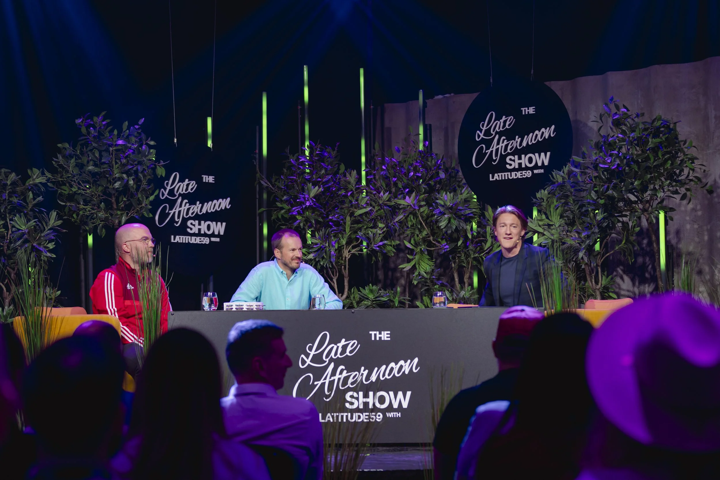
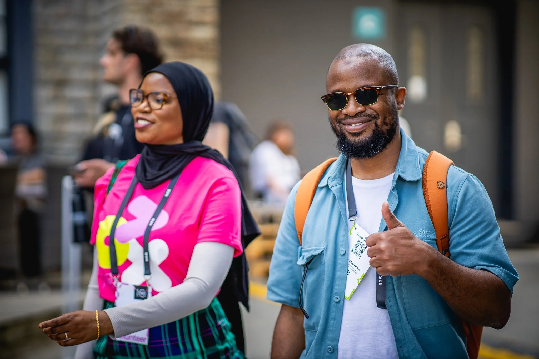
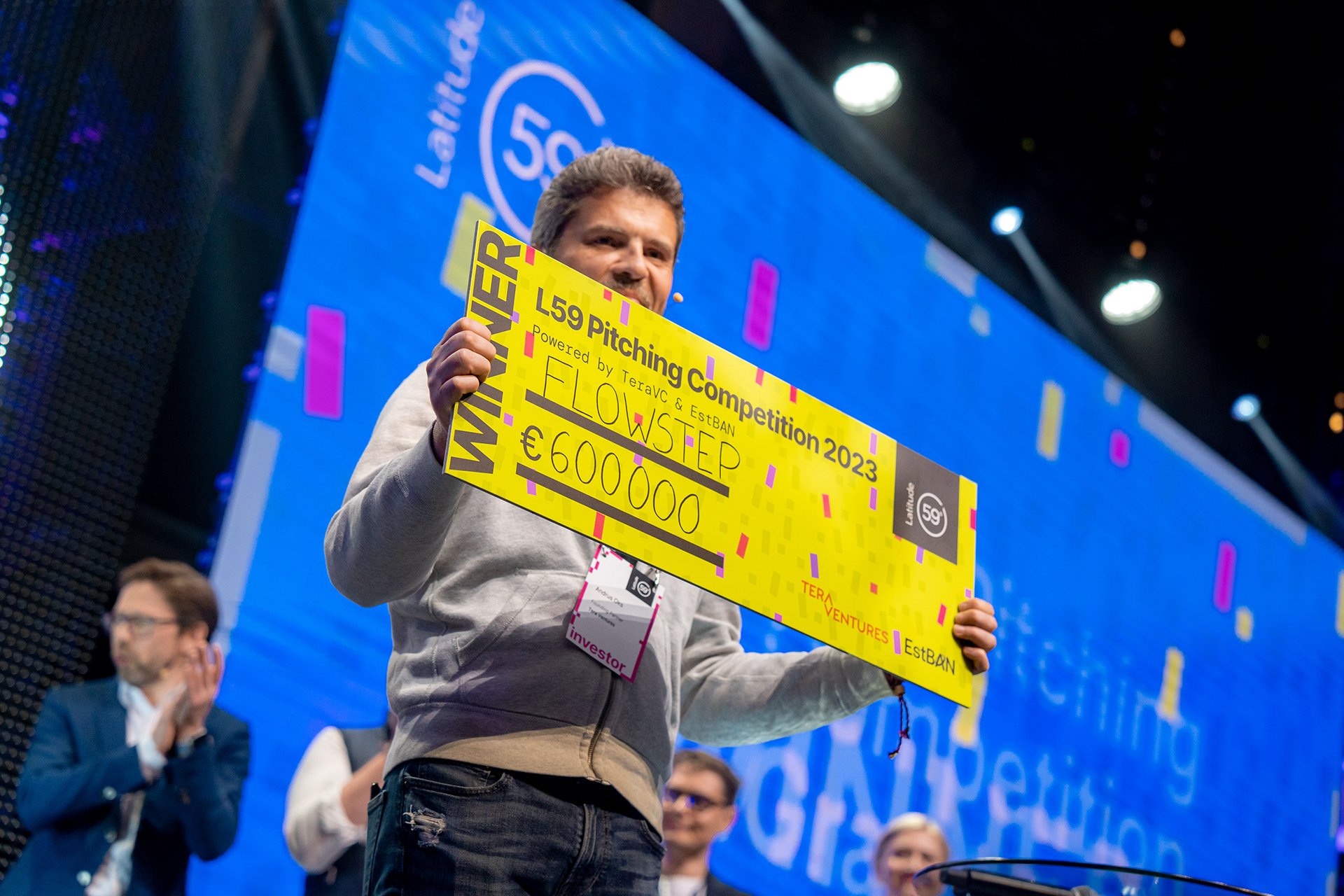
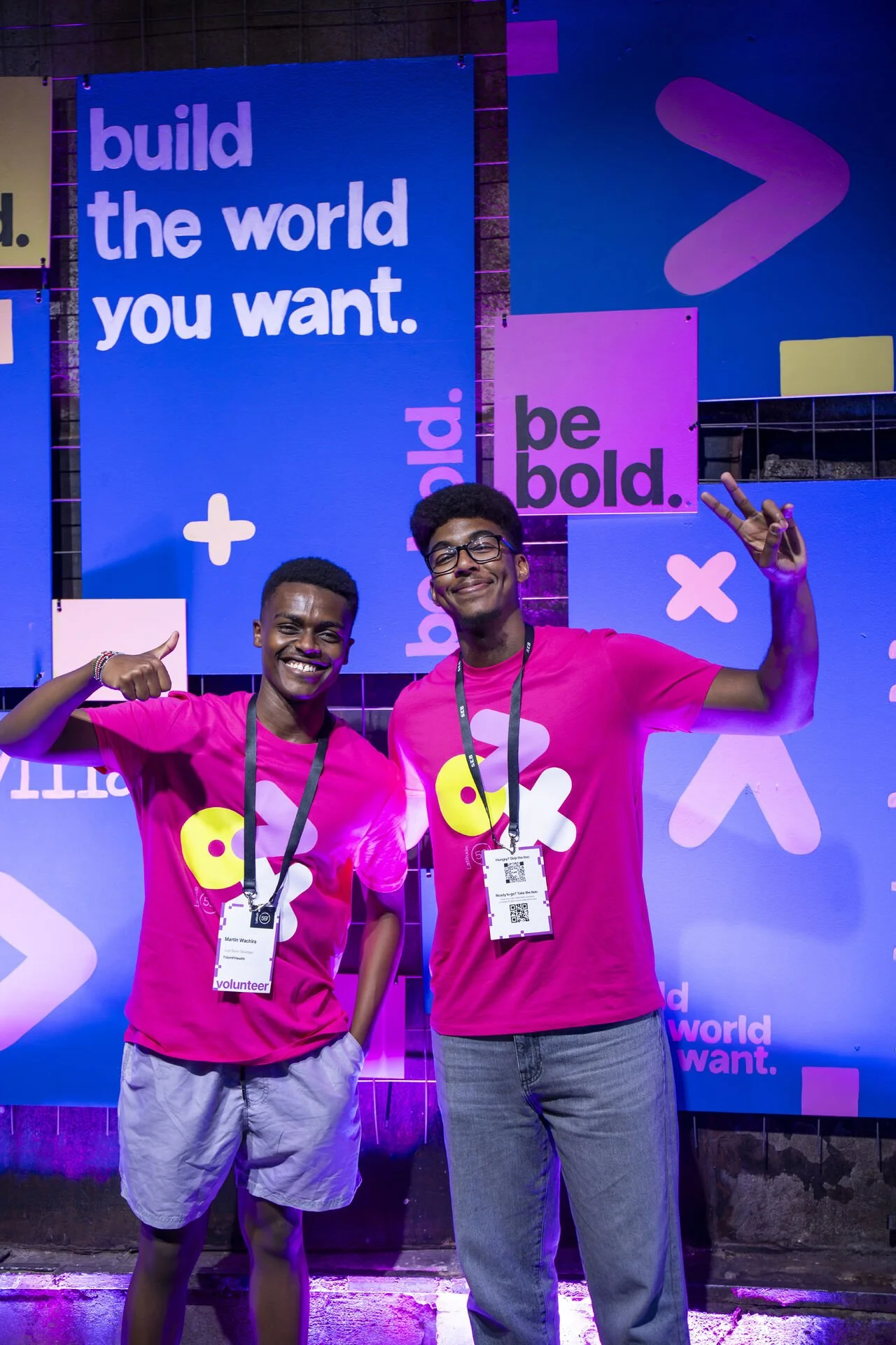
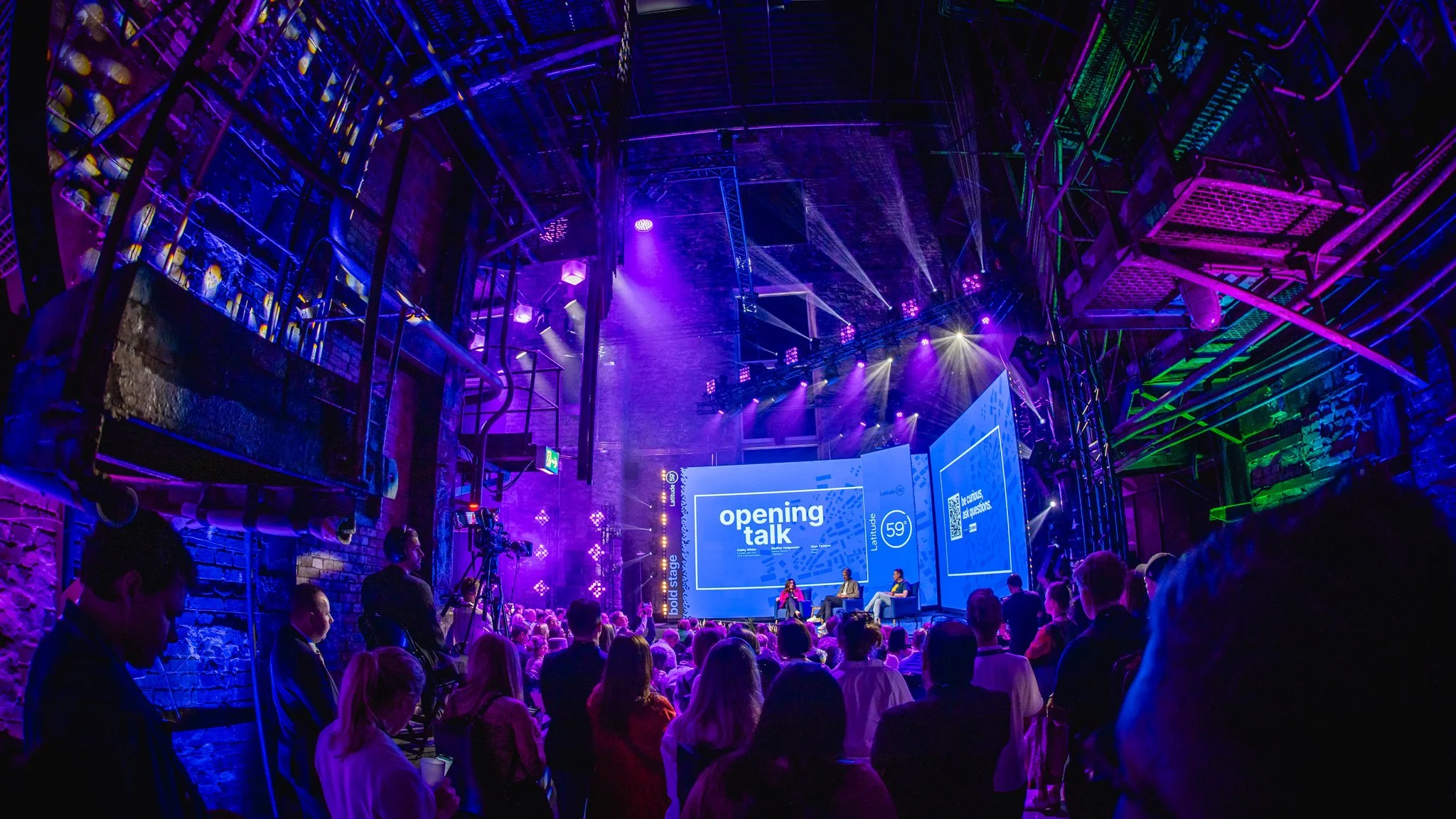
Latitude59
Client from 2023-2026
Latitude59 is one of the most visited tech conferences in Europe and the flagship event of Estonian technology sector. As Latitude59 has lived with its basic branding for over ten years, it was finally time for a refresh.
We decided to keep the existing logo, but brought new ideas through an updated color scheme and visual elements. We committed to a bold direction — and that year, Latitude59's own slogan became 'be bold.'
We expressed the fresh branding through updating the website and all social media assets, created printed and digital materials for the conference and decorated the team and volunteers with cute branded t-shirts. We also hand-painted a reusable photo wall that has become the staple of Latitude59 conference.
We accomplished a fresh, memorable look that the team loves and the audience connects with — one that inspires people to show up as themselves.
Thank you for taking the time
If something here resonates, we'd love to hear from you
You’re welcome to stay connected in Linkedin & Behance